
Rambus Blockbuster Chartology

By Catherine Austin Fitts
My “go to” website for technical analysis of precious metals, the US dollar & the US stock market is Rambus Chartology, where Rambus (that’s his handle – he’s the founding technical analyst) leads a discussion with extensive charts of what the markets are saying.
In January 2016, Rambus launched his quarterly Solari Report with a Blockbuster Chartology. You can find links to the entire series of quarterly and annual Blockbuster Chartologies at the end of this latest piece.
One of the reasons that Rambus is so good at his craft is that he focuses on “staying on the right side of the major trend.” The challenge of doing so at this time is that it is tempting to look for bottoms or to assume that the trend upwards in the US dollar or stock market may be over. However, Rambus consistently brings us back to the discipline of the Chartology. What does price tell us? As he describes so aptly, we are dealing with psychological warfare.
Sitting back once each quarter to get this perspective offers invaluable insight. So, here we go for the 1st Quarter 2025 Wrap Up Blockbuster Chartology!
Blockbuster Chartology Quarterly Report
By Rambus
~ 1st Quarter 2025 Wrap Up ~
Stagflation, Inflation, or Deflation: How Oil’s Performance Will Influence the Market’s Future.
Stagflation, Inflation, or Deflation: How Oil’s Performance Will Influence the Market’s Future.
The million-dollar question on everyone’s mind right now is, how are the tariffs going to affect the markets? Everyone seems to have their own opinion on what lies ahead, but I’m not going to discuss what they think, but rather try to present to you with what the Chartology is suggesting.
I mentioned this past week that I was keeping a very close eye on the energy complex and oil in particular for signs of what may lie ahead, as oil is the lifeblood of the world economy. In the past, when oil rallies strongly, inflation rises, as it affects just about everything on the planet to a certain degree.
The opposite is true when oil crashes, as we’ve seen several times in the past; deflation takes center stage for a period of time. The last example was during the 2020 pandemic, in which just about every major asset class crashed when oil actually went negative for a very brief period of time, which is hard to believe.
As the pandemic finally eased, oil began to rally like it had never done before. From the March 2020 crash low, and in less than two years, in January 2022, oil rose to $130.50 a barrel. The word went from a deflationary collapse to inflation being out of control, which is why the Fed had to step in and start raising interest rates to the extent they did.
Now the question is, how are tariffs going to affect the economy? Are they going to be a short-term event that will have little impact for the longer term, or are they going to have major consequences for the US and world economies in a negative way for longer than most think possible?
Let’s look at what the Chartology is suggesting, so we can have at least a historical understanding of what may lie ahead of us to some degree, as history often rhymes but doesn’t repeat exactly. Also, it’s essential to keep in mind that the tariffs can be lifted at any time, and we can wake up one morning and see the DJIA is up over 5,000 points, the S&P 500, and so on, which is why there is so much uncertainty in the markets right now.
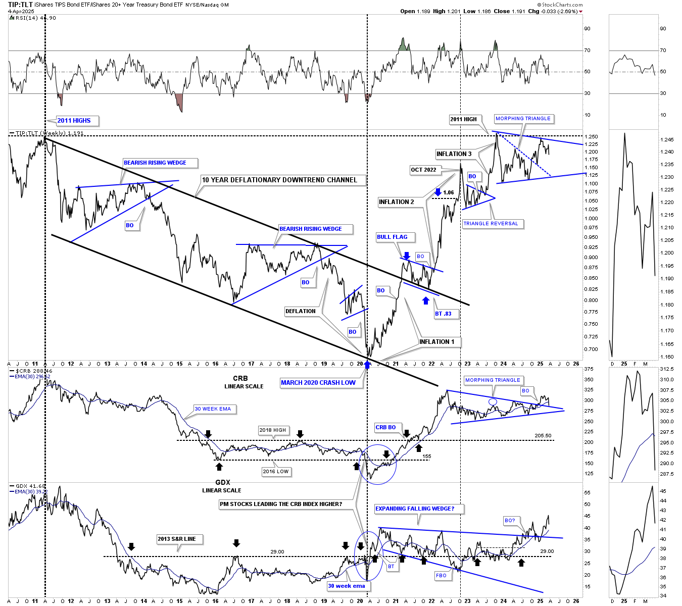
Before we look at some energy stocks, let’s start with the TIP:TLL ratio chart, which I use to help me gauge if inflation or deflation has the upper hand. We’ve looked at this weekly combo chart many times over the years, and it has done a pretty good job of showing us when the deflationary environment was in place, which isn’t a bad thing when it progresses over many years.
As you can see, the ratio chart on top begins at the 2011 all-time high for the CRB index, with the GDX on the bottom. That peak was followed by the perfectly formed parallel downtrend channel with two smaller blue triangle consolidation patterns. The CRB and GDX on the bottom fell roughly in line with the declining ratio when everything came to a pandemic crash low in 2020, as shown by the blue circles.
Note the price action off the 2020 low and the sharp rally in the ratio, which warned that inflation was rearing its ugly head. After breaking above the nearly ten-year downtrend channel, a small blue flag formed the backtest, signaling the 2nd inflationary spike was underway, which carried the ratio to its next peak before the price action began to consolidate that leg. The last bout of the inflationary spike ended at the first hit of the 2011 resistance line and has been either forming a consolidation pattern for the next leg up in the inflation picture or a topping pattern that is going to signal deflation is coming back into the picture once again if new lower lows are seen.
From that pandemic crash low in 2020 began the inflationary spiral that took the TIP:TLT ratio all the way back to the 2011 high, where it has been consolidating just below that very important 2011 horizontal resistance line. The last time we looked at this chart a month or two ago, I showed a possible triangle forming just below the 2011 high, which is still a triangle, but looks like it’s morphing into a bigger trading range if support can be found on the bottom trendline and a rally back up to the top of the pattern. Since we have an incomplete trading range so far, anything is possible. At least for the near term, the 2011 resistance line is holding inflation in check, and a drop below the bottom of the blue trading range would signal a deflationary environment would come into play.
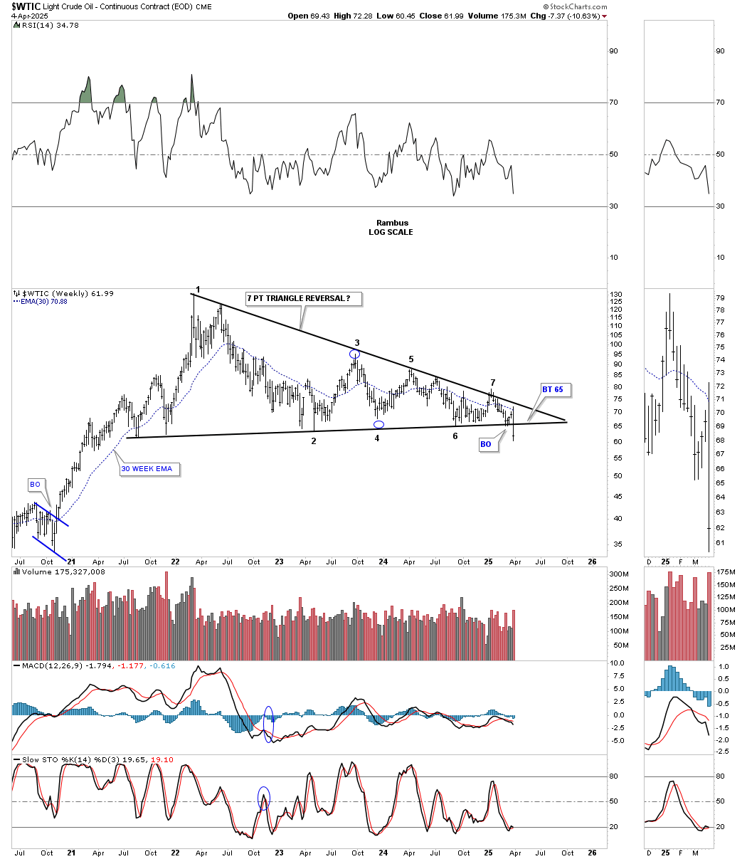
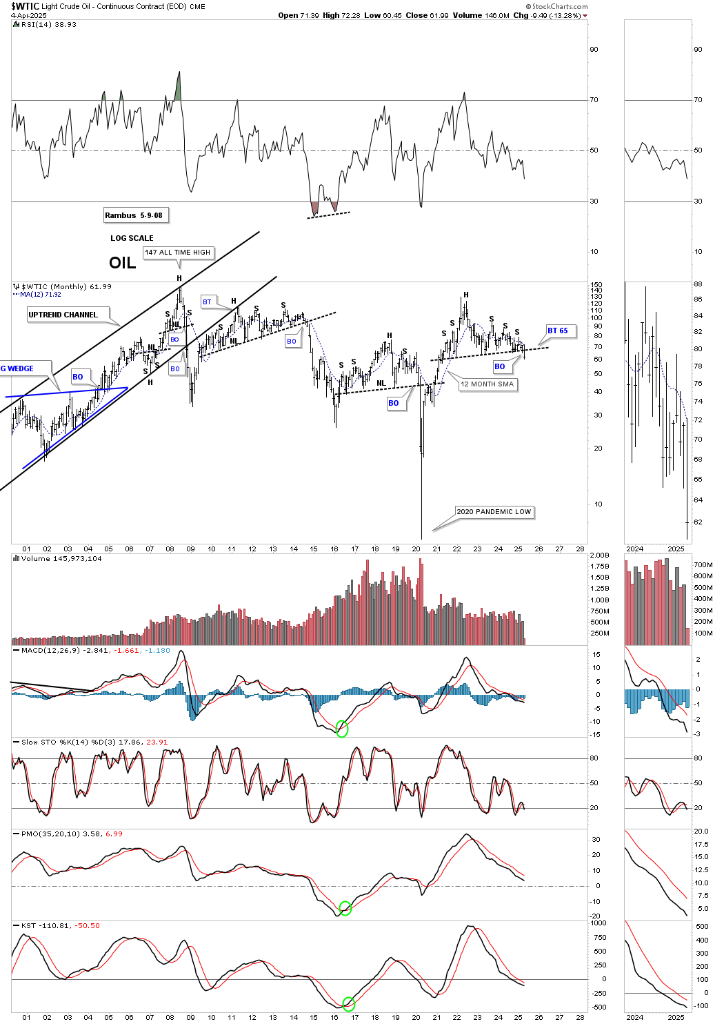
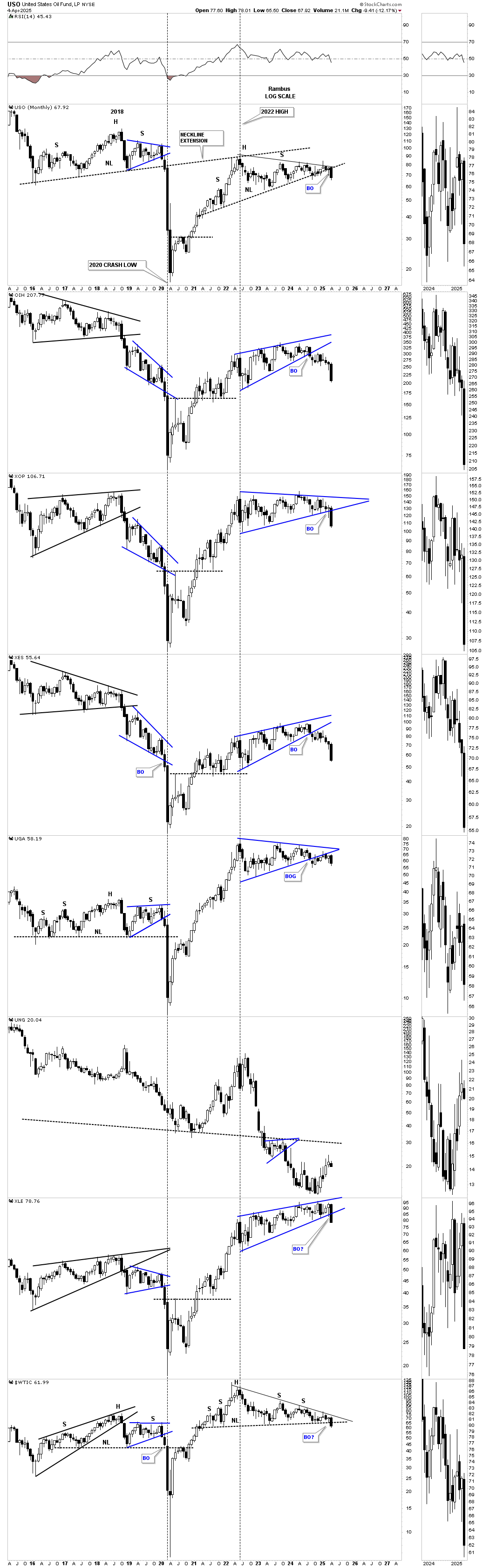
As I’ve been suggesting, oil will play a key role in what will be the likely outcome for the inflation or deflation debate. Let’s start with this very simple weekly chart for WTIC, which shows a very tight 2022 triangle that broke the bottom trendline last week, which is the first sign oil is probably headed lower. I have 7 reversal points on this chart, which makes it a reversal pattern to the downside. It could be easy to add four more reversal points in the apex, which would give us eleven, but 7 is good enough.
Looking at some older charts for oil, you can see two unbalanced H&S tops on this weekly line chart. There was the one that formed with the head forming at the 2018 high, which led to the 2020 pandemic crash low, reaching its measured move dead on the money. Next came the rally, which led to the inflationary spiral to the double top high around the 135 area. That double top ended up forming the head of the larger H&S top, which has already broken below the neckline, forming the blue expanding triangle as the backtest. Note the breakout last week of the blue expanding triangle.
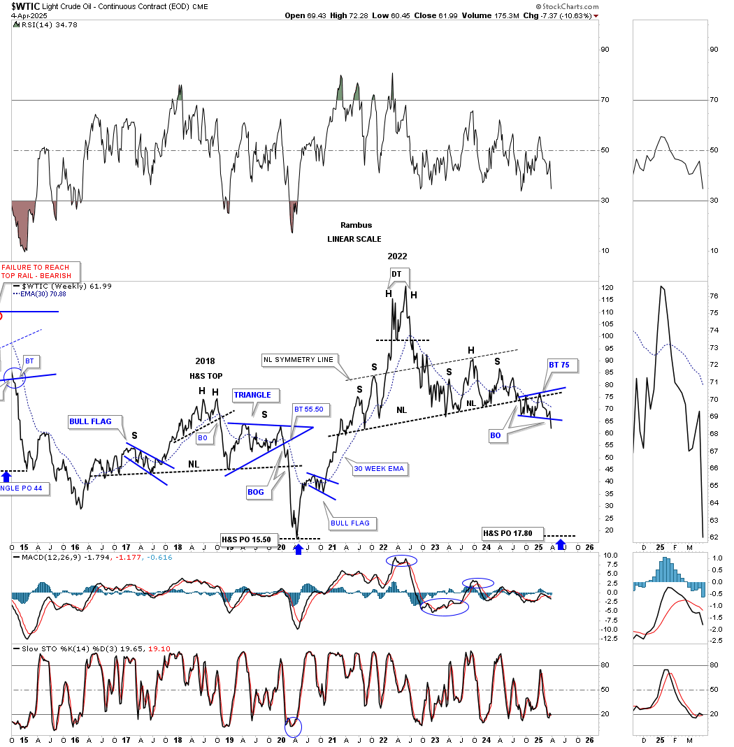
This next chart for oil goes back about 25 years. On the left side of the chart, you can see the parabolic rise oil had into the 2007 all-time high. When oil finally topped at 147, it collapsed in a vertical move all the way down to the 35 area, which, if you recall, is when we saw the stock markets and the precious metals complex have their 2008 crash. Oil loves to build unbalanced H&S tops with small left shoulders and large right shoulders. It loves to tease you before the breakout below the neckline, as it looks like this time we are finally going to get the breakout, and then another rally off the neckline that is just a bit shallower than the previous shoulder high. Eventually, the breakout will happen, as you can see in 2014, which led to a deflationary collapse in most commodities. In 2016, WTIC put in the head on the inverse H&S bottom, which measured up to the 2008 downtrend line. Looking at the right side of the chart, you can see the current unbalanced H&S top, which shows the breakdown finally taking place last week. The thing about H&S tops in oil is that they generally don’t waste much time declining once the neckline is broken. We may or may not see a backtest before the impulse move to the downside gets underway.
Looking at another long-term chart for oil, you can count four H&S tops beginning at the all-time high at the end of the parabolic run to 147, followed by the crash. The next H&S top formed just beneath the bottom rail of the uptrend channel after oil topped at 147. Again, you can see how unbalanced it was, but that’s oil’s personality, and when the neckline was broken, another strong decline ensued.
After that decline came to an end, another H&S top formed that was a little more symmetrical, and that one led to the pandemic crash low in 2020, creating that deflationary event. That V-bottom produced the strongest rally in the history of oil, which took less than two years to reach the 135 high where the head of the current unbalanced H&S top has formed. Last week, you can see the breakout below the neckline.
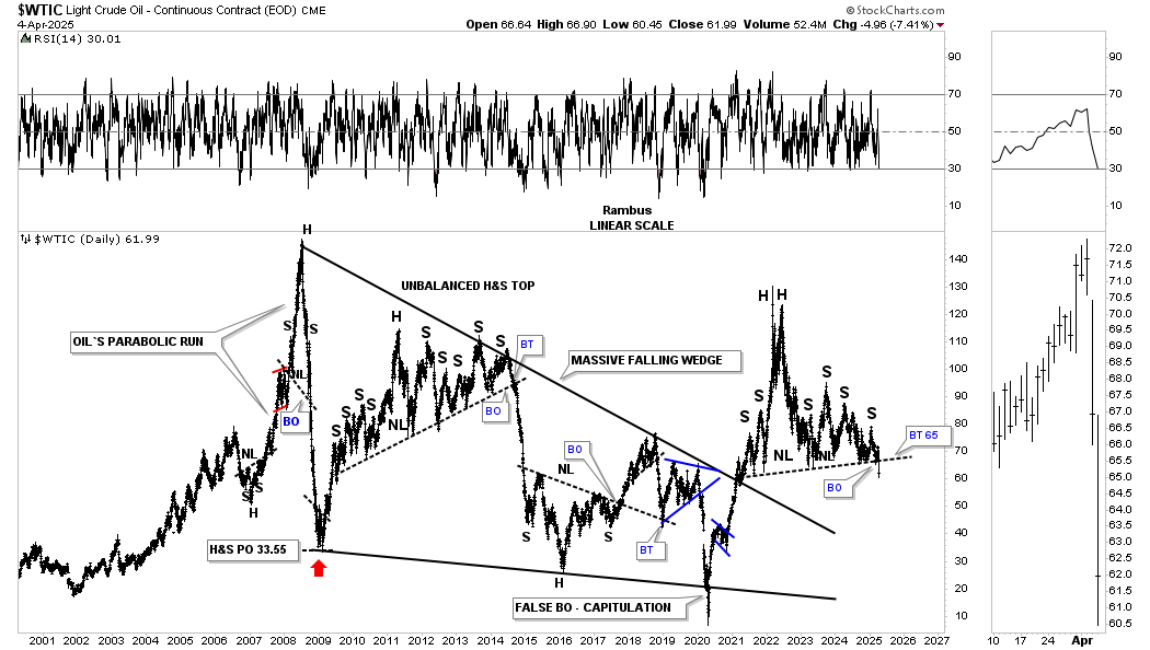
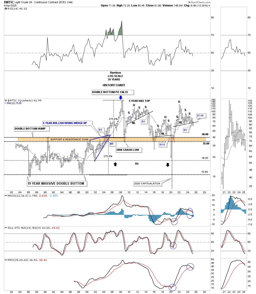
This last chart for oil is the one I’m most proud of because I built it many years ago, showing the massive double bottom base with the blue bullish rising wedge, which formed just below the brown shaded S&R zone or double top trendline, that was strongly suggesting that if the breakout came to the upside, we would see a measured move up to 146, the width of the massive double bottom. As it turned out, the measured move was dead on the money at the all-time high.
But that wasn’t all that this historical chart for oil helped us with. Long-term members may recall that first unbalanced H&S top when oil found initial support on the brown shaded S&R zone / double bottom trendline at 35. That rally led to the unbalanced H&S top we spotted a mile away, but every time the price action hit the neckline, another bounce occurred, and on and on it went until the neckline finally gave way, which led to another test of the brown shaded S&R zone, where the second bounce occurred, and the second H&S top formed, which was a little more symmetrical, with that one leading to the 2020 pandemic crash low and another deflationary event.
The V-bottom off the 2020 low took about two years to complete, reaching 135, just short of the all-time high at 147 made in 2007. And again, you can see another unbalanced H&S top with the neckline being broken last week. The minimum price objective for any H&S top is the distance from the head to the neckline added to the breakout point, but as you can see, the previous H&S top’s price action declined much further.
One last important detail on this history chart for WTIC, and that is the black arrows I put on this chart when the price action declined from that first H&S top. Those two black arrows show how I was looking for possible reverse symmetry back down over the same area on the way up. As you can see, the decline from the first H&S top came down to the brown shaded S&R zone and bounced, but penetrating it before moving higher. It wasn’t until after the 2nd H&S top completed that we finally saw the reverse symmetry to the bottom of the chart, completing the reverse symmetry move.
To be honest, when I first put those black reverse symmetry arrows on the chart, I really didn’t think they would ever play out, but the way the chart was set up, I couldn’t resist. That is one reason it’s essential to let the chart speak to you and not try to second-guess what it may be telling you, no matter how absurd it may look.
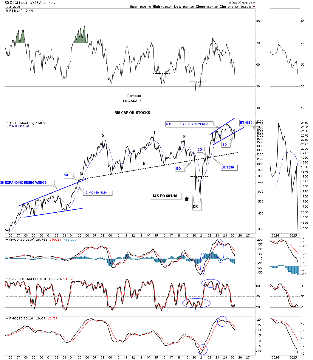
Let’s continue looking at some different areas in the energy complex, beginning with the XOI, which is a big-cap oil stocks index. This long-term, 30-year monthly chart shows the price action forming a massive H&S top with the neckline finally giving way just before the 2020 pandemic crash, with the minimum price objective being reached where the double bottom reversal pattern formed. Note how the price action interacted with the old neckline on the way up, where it initially rejected the price action for a very short period of time before the move back above held. After a quick backtest from above, the rally continued, chopping out the blue 5-point bearish rising flag reversal pattern. We can now call it a 5-point rising flag reversal pattern because the bottom rail was broken last week, with now a possible backtest from below possible.
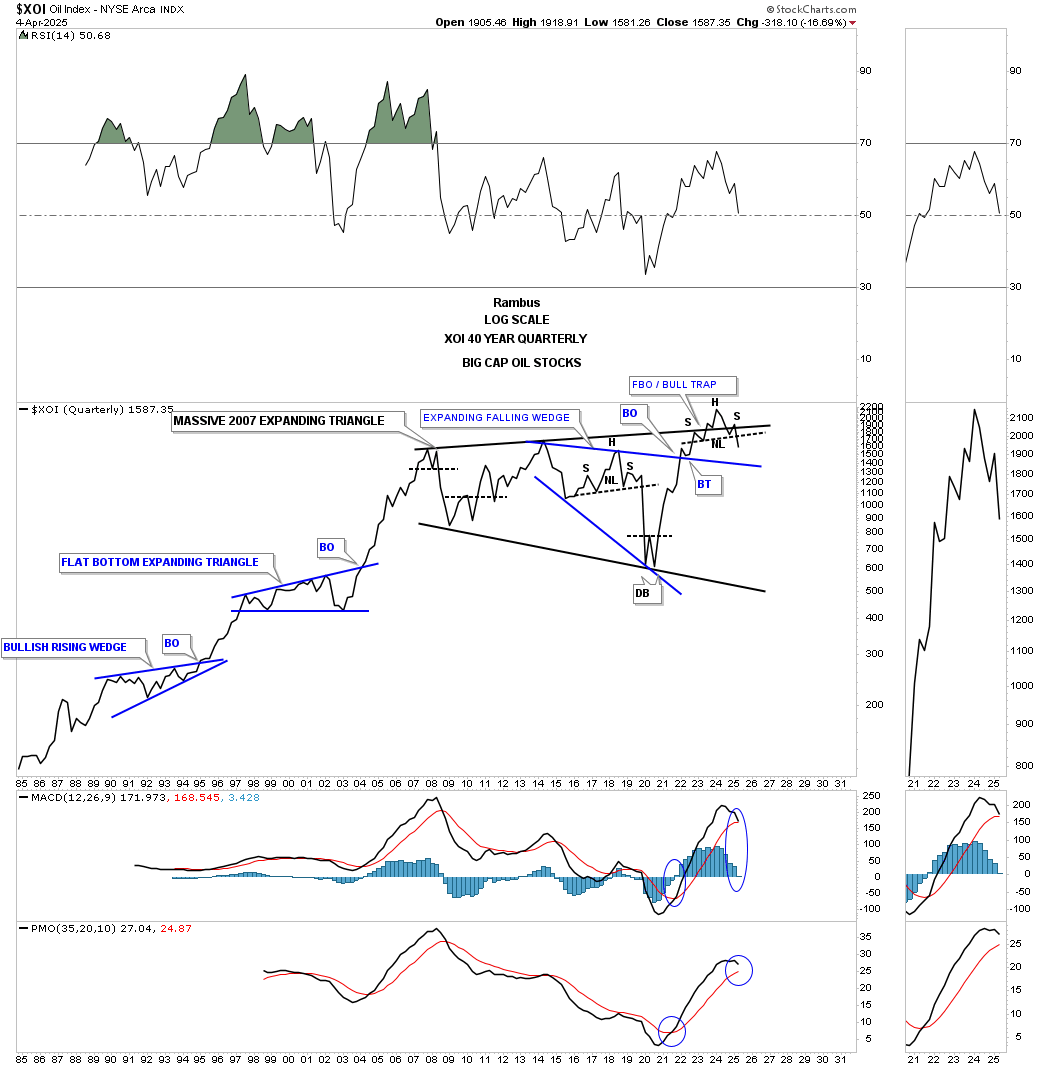
When looking at the 40-year quarterly line chart for the XOI, the Chartology is starting to look a little ominous for the long term. After finally breaking out above the 2007 black expanding triangle, the price action failed to move much higher and has just recently closed back inside the black expanding triangle, showing us a false breakout/bull trap.
When looking at just about every sector in the markets, the 2020 pandemic crash low is the benchmark in which most major reversals took place over the last five years or so.
Looking at the XLE, energy stocks fund, it built a massive bullish expanding falling wedge with the last reversal point being the 2020 crash low. As was pretty normal back then, many times the price action reversed symmetry to the upside because the decline was so vertical in nature. As you can see, XLE formed an unbalanced double bottom, which led to the inverse H&S bottom that formed the last reversal point in the four-year bullish expanding falling wedge.
Since breaking out above the top rail of the expanding falling wedge, XLE has been in a slow grind higher, forming the blue bearish rising wedge reversal pattern with a breakout below the bottom rail last week. The blue bearish rising wedge is one of those patterns you could see a mile away, but every time the price action would reach the bottom of the trading range, another bounce would occur. This time, I think it’s going to be different, as we are seeing breakouts across the board in the different areas in the energy complex.
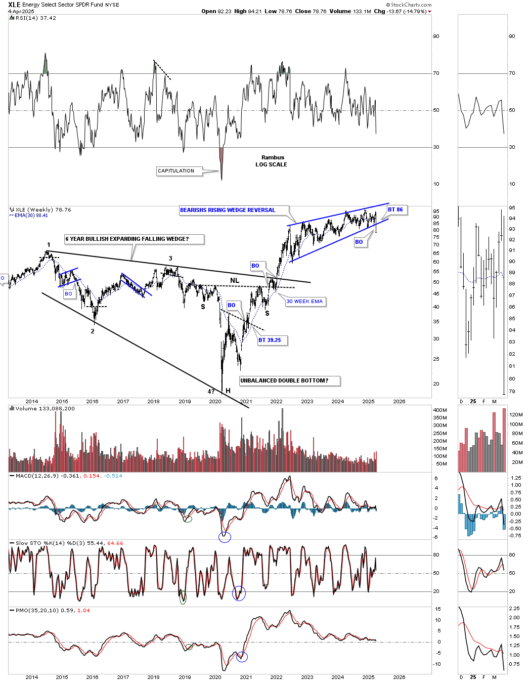
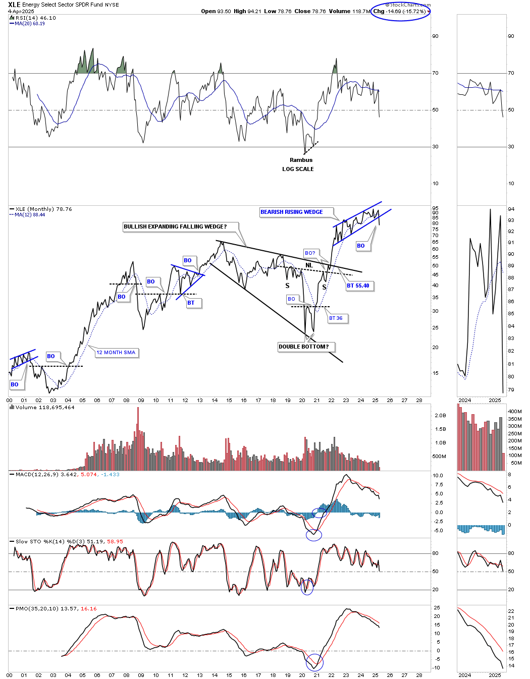
The long term monthly line chart for the XLE putting the blue bearish rising wedge into perspective.
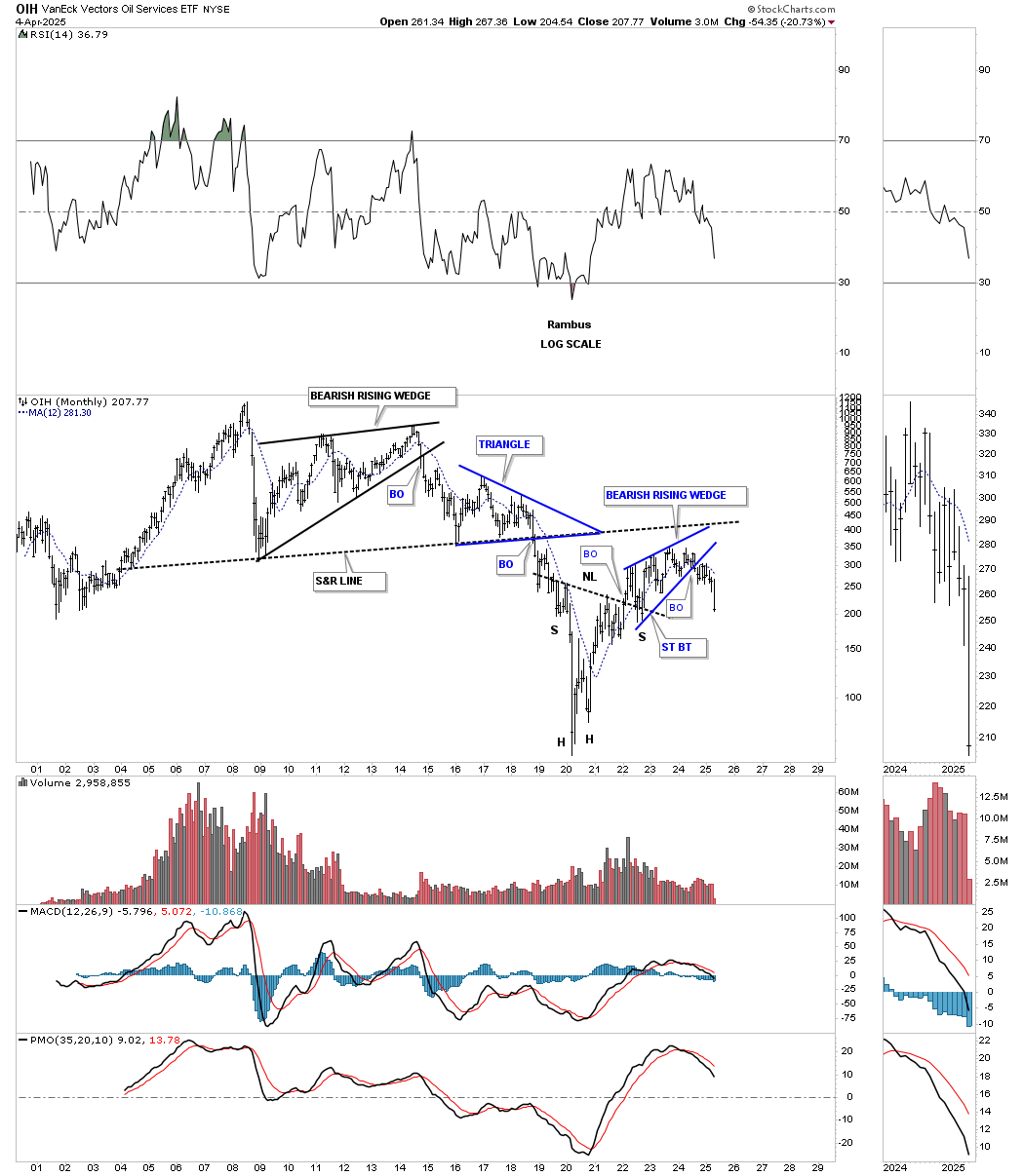
The OIH, oil service ETF, formed a massive topping pattern and crashed into the 2020 low like everything else, but the OIH never showed the strength of other sectors in the energy complex, barely making it up to the multi-year S&R line, where you can see it has already broken down from the blue bearish rising wedge in a more pronounced fashion last week.
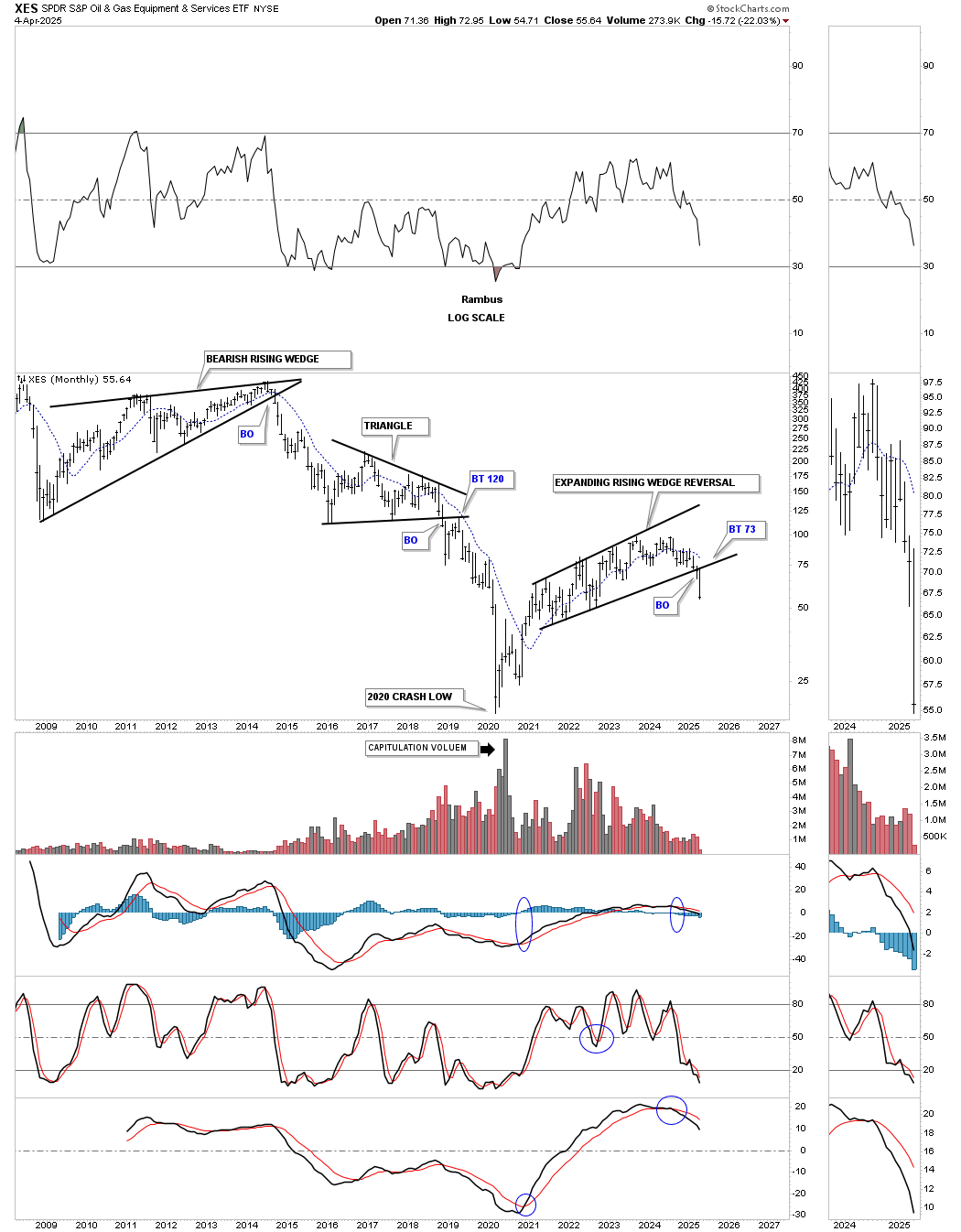
The XES, Oil & Gas Equipment & Services ETF, has also been weaker than oil itself, chopping out the bearish expanding rising wedge with the breakout last week.
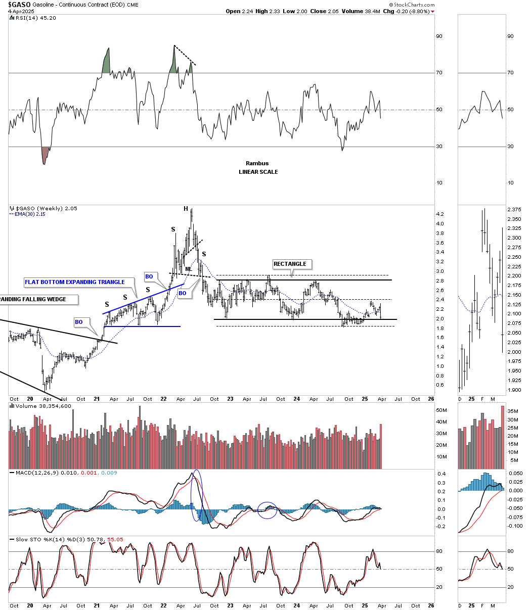
GASO, gasoline, enjoyed a big rally out of its 2020 low, forming the blue flat-bottom bullish expanding triangle with the impulse move ending with a double H&S top. Since the initial decline, the price action has been trading sideways, chopping out the two-year rectangle, which I’m going to call a consolidation pattern to the downside, even though it hasn’t broken down yet. The reason I’m going out on a limb and calling it a consolidation pattern is because of the last bounce off the bottom rail, which only made it back up to the center dashed midline, which many times marks the last reversal point before the breakout.
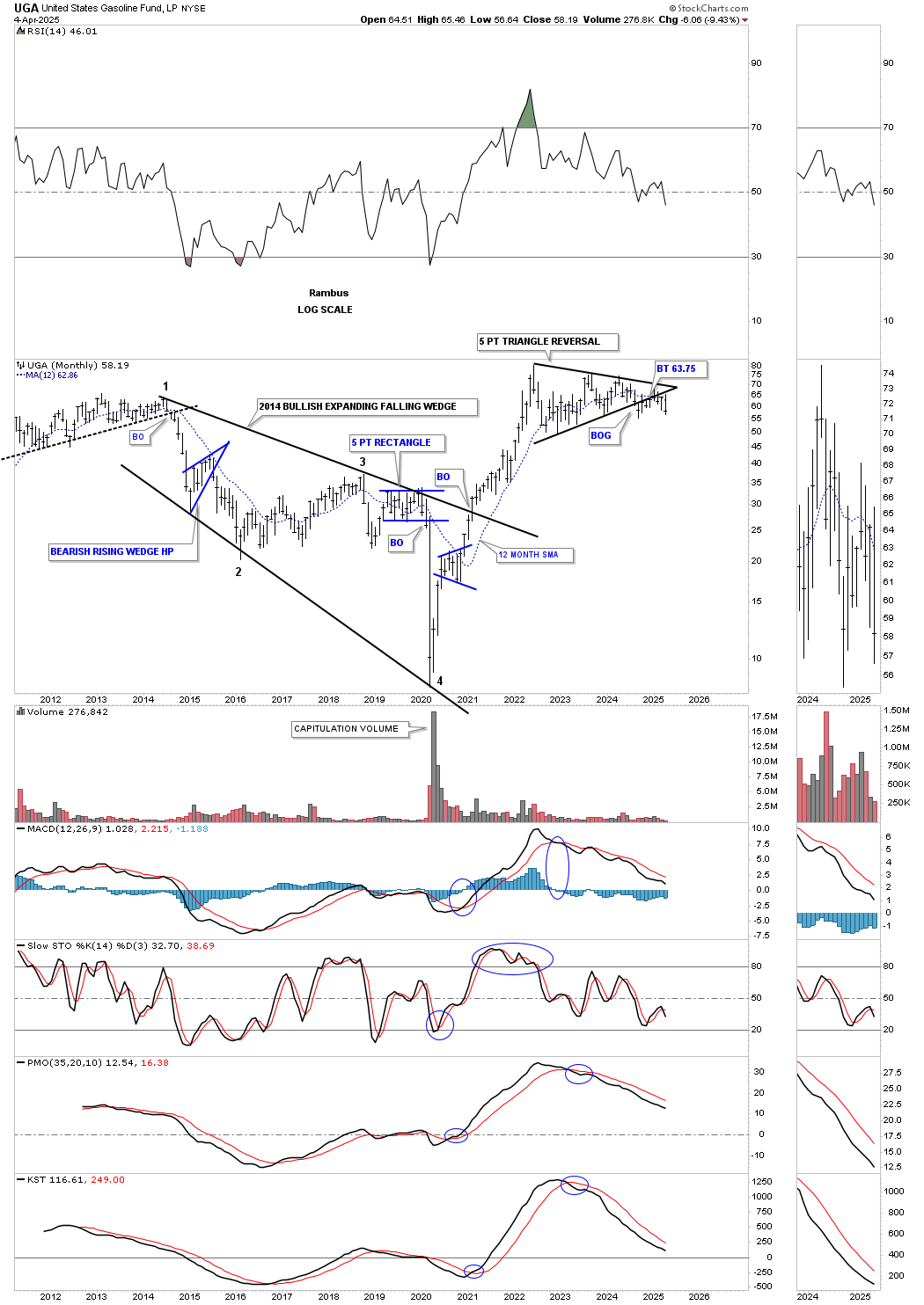
UGA, US Gasoline Fund, had a massive rally out of its 2020 low, but has been trading sideways since the initial high was made. As you can see, it has been forming one of those aggravating trading ranges, which we looked at previously on WTIC, showing every time the price action reaches the bottom trendline, another bounce takes place. Currently, the price action has been hugging the bottom rail for close to a year now, but still hasn’t made a new lower low, so the breakout isn’t confirmed yet, but I think it’s just a matter of time, especially with last week showing an outside weekly bar.
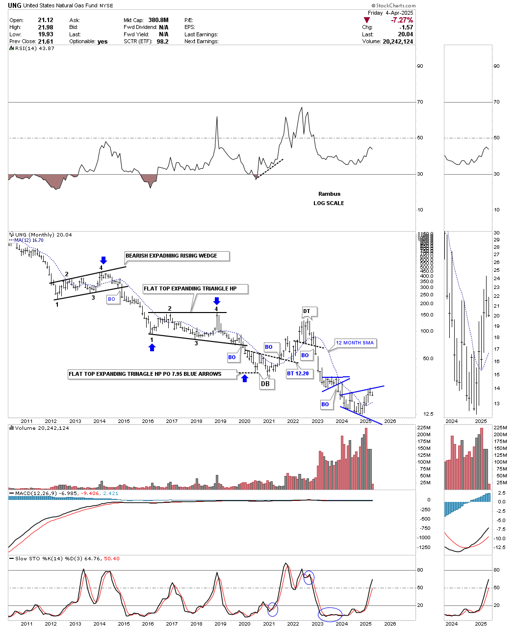
UNG, Natural Gas Fund, has been in a long-term decline and shows little promise of a sustainable rally to the upside yet. It does tend to move in the opposite direction to the rest of the energy complex, as the current price action is trading below its 2020 crash low. Maybe its day will come, but they call UNG the “widow maker” for a reason.
Next is the monthly candlestick combo chart for the energy complex we’ve been following for many years. On the left side of the chart, you can see the large trading ranges that were in place before the 2020 crash occurred. I’m still amazed at how the markets, and in this case the energy complex, could see the big decline coming years before the pandemic crash took place, which completed what those patterns were suggesting was going to happen. Maybe not to the degree of the vertical move down, but a big decline was going to take place, given the size of the trading ranges.
As you can see, since the 2022 high, the energy complex has been trading sideways for the most part and is now starting the breaking-out process, with a few a little further along than others. The only question now is, will we see a backtest? From the trading ranges on the left side of the chart, on this monthly perspective, there were no backtests.
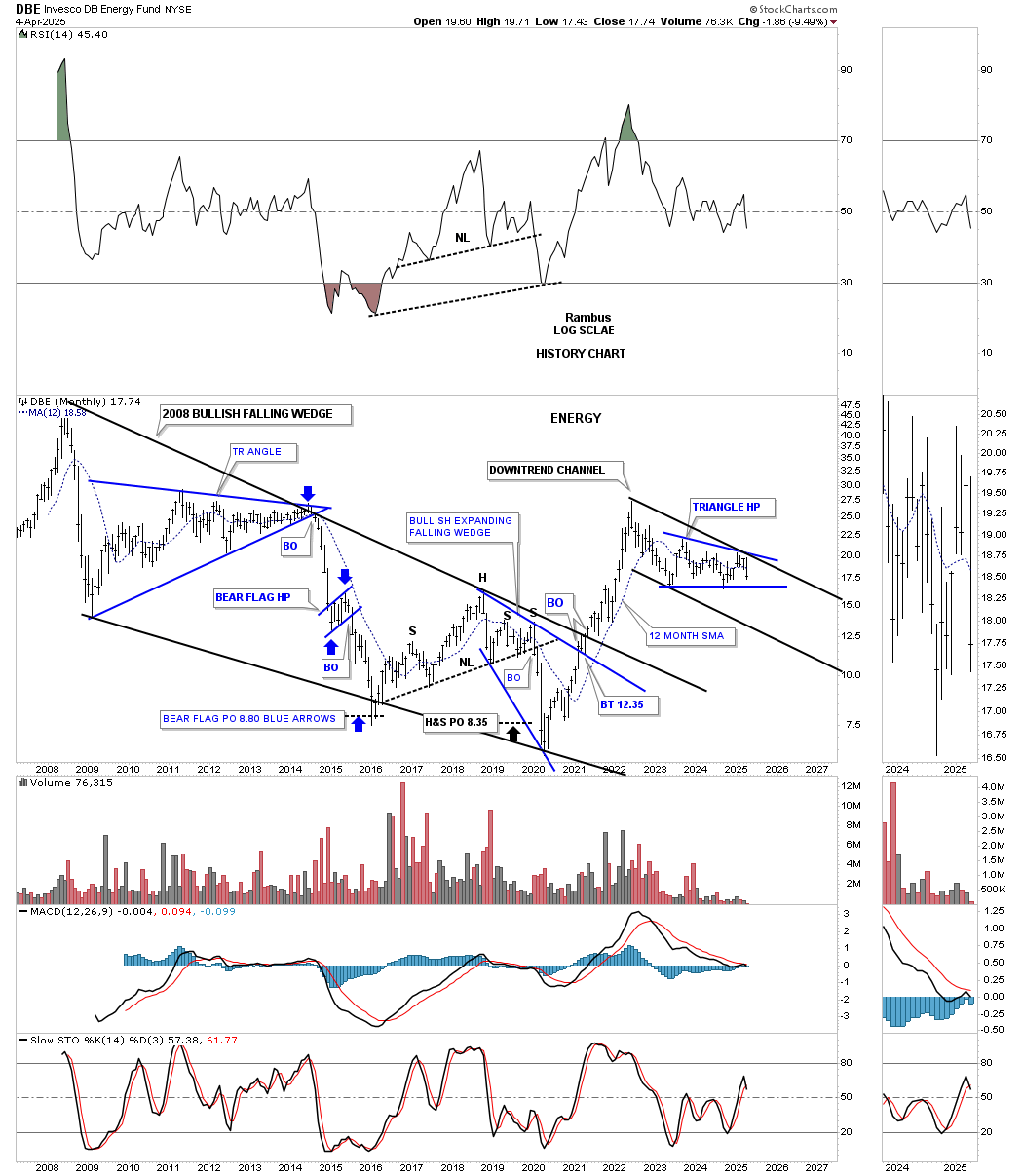
Let’s look at some areas in the commodities complex and see if they’re shedding any light on the deflation/inflation debate. The DBE, energy fund, moved vertically out of its 2020 low and topped out about two years later, unable to move higher. It’s been working on the blue triangle, which could be forming in the new downtrend channel if the bottom rail is broken, which would show the blue triangle as a halfway pattern to the downside.
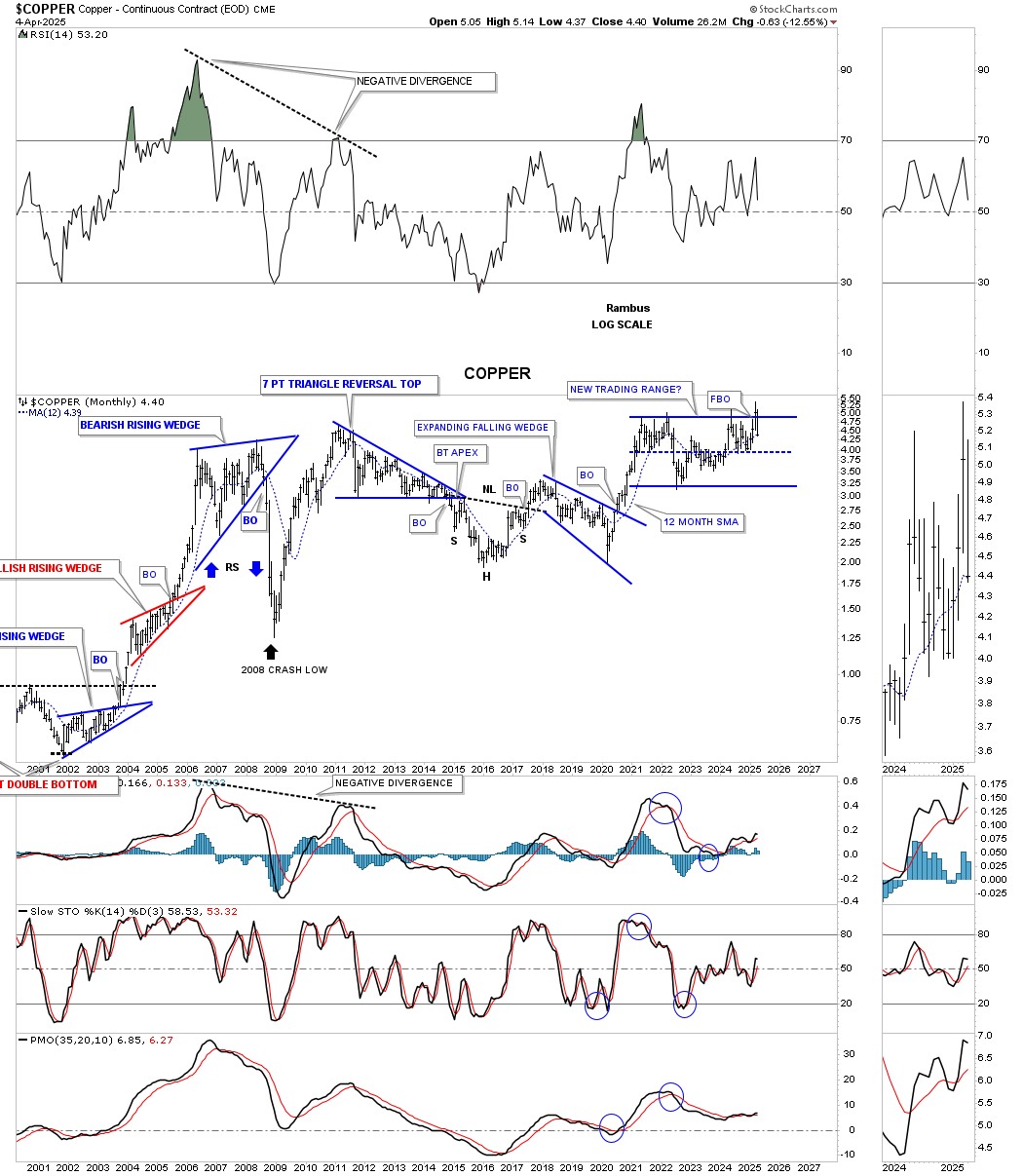
Last month, Copper broke out above the top rail of its blue trading range, only to fail and is now trading back inside. For the time being, we have to call that a false breakout/bull trap.
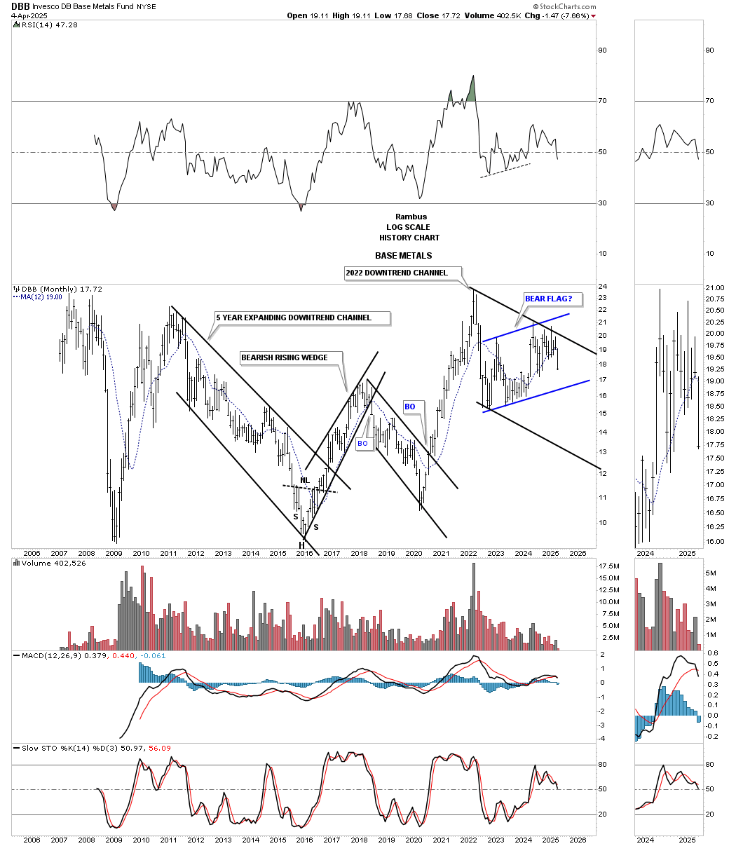
This history chart for the DBB, base metals fund, enjoyed a big rally out of its 2020 low, but like so many areas in the commodities complex, it hasn’t been able to make a new higher high. A touch of the bottom blue trendline will complete the 4th reversal point in what could be a blue bear flag, a halfway pattern if the bottom rail is broken.
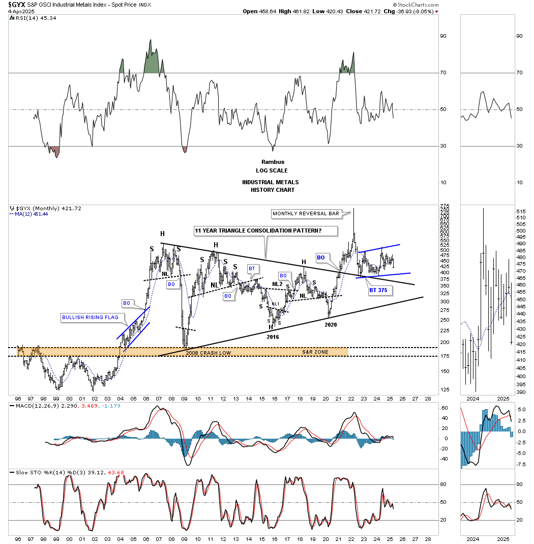
The GYX, Industrial Metals Index, is set up similar to the DBB above, as it has been chopping sideways to up, forming a possible bear flag.
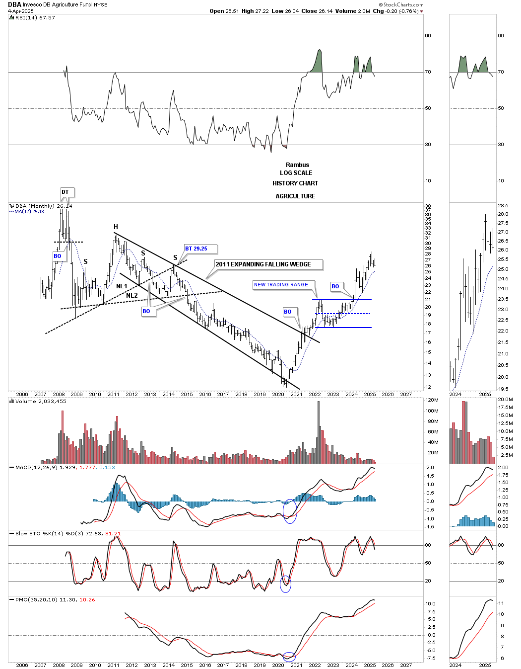
The DBA, Agriculture Fund, has remained one of the stronger areas, as it’s not trading too far off its most recent high.
Let’s now look at a few different commodity indexes to see if they can give us any indication of what may lie ahead in regards to inflation/deflation.
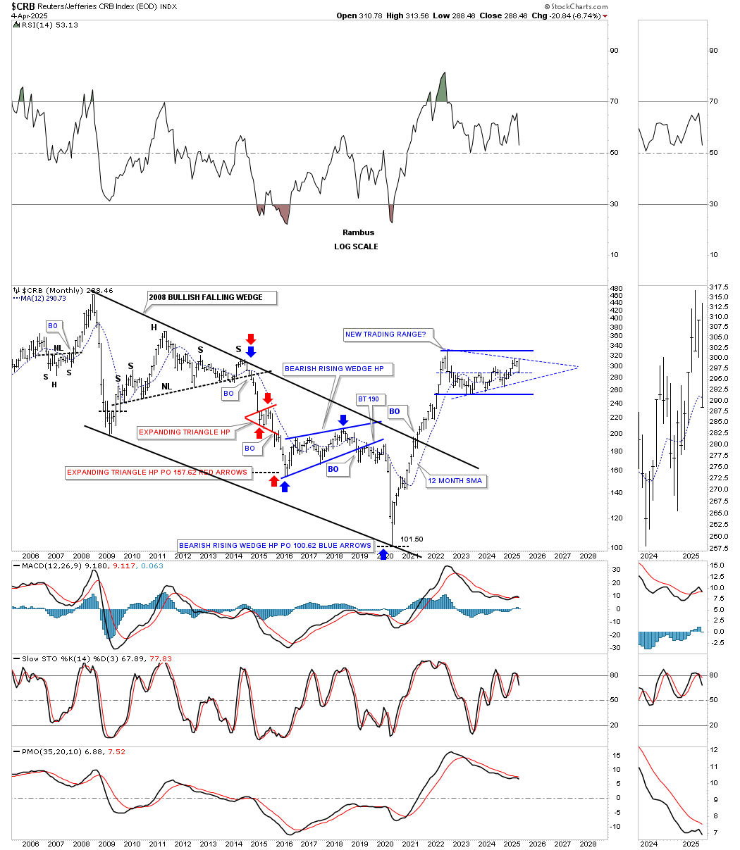
Since the CRB index topped out in 2008, it began a long, drawn-out bear market that lasted until the 2020 crash low. Note how that perfect bear market downtrend unfolded from the 2008 high, with each impulse move lower followed by an H&S consolidation pattern.
The V-bottom out of the 2020 low was too vertical to sustain itself and needed time to form some type of consolidation pattern or a possible topping pattern. There isn’t enough information yet on the current trading range to really know what pattern may be forming, only that a trading range has been under construction since the 2022 rally high.
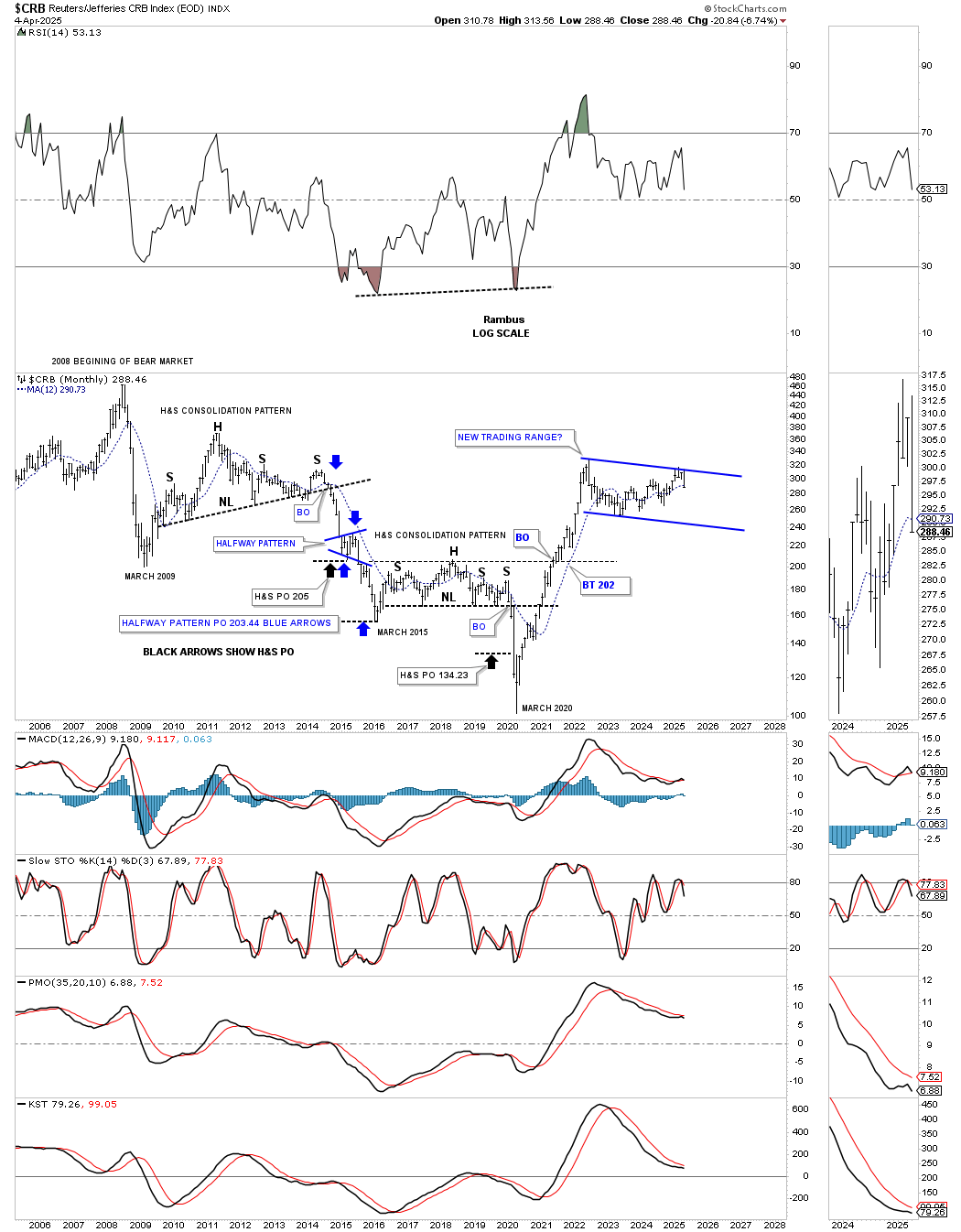
This monthly chart for the CRB index is the same chart as the one above, but just a little different, and shows some measured moves made on the way down in the 2008 bear market, as shown by the colored arrows. There is no definitive trading range showing itself since the 2022 high, only possibilities at this time.
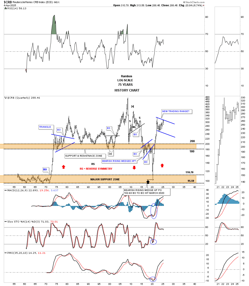
Next is the long-term history chart for the CRB index that I built at the same time as the WTIC history chart we looked at earlier. This one also has been playing out beautifully. I still remember when I first posted this chart that many couldn’t comprehend how the CRB index could crash all the way down to the lower brown shaded S&R zone. If you look at the rally out of the early 1970s low, note how vertical it was, which was the key, because if the price action ever broke below the upper brown shaded S&R zone, there wasn’t anything to slow down the CRB index until the 1970s low was achieved.
Note how the red arrows on the left side of the chart showed the vertical move up out of the 1970s low and then back down during the 2020 pandemic crash. Because there still weren’t any consolidation patterns that formed between the two brown shaded areas, I added the red arrow pointing up after the 2020 low was established, looking for reverse symmetry back up again, which happened. Now we just need to have patience to see what develops during the current trading range.
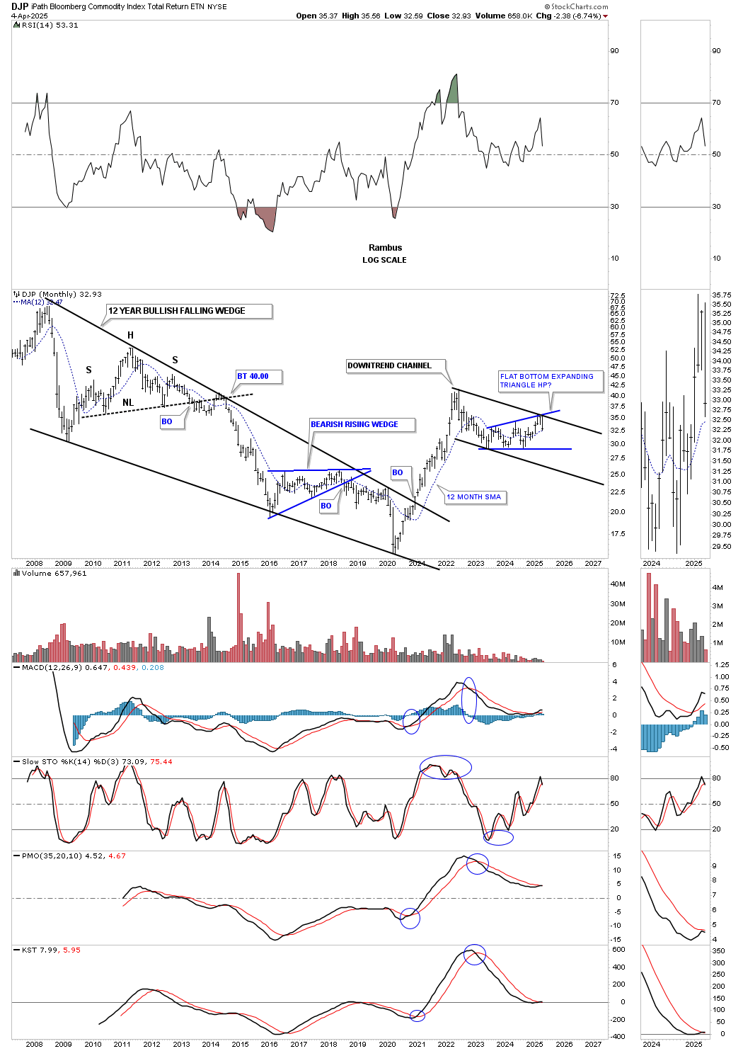
The DJP, Bloomberg Commodity Index, built a bullish falling wedge as its 2008 bear market. Again, the rally out of the 2020 pandemic low was too vertical and either burned itself out or needed time to consolidate its gains. At this point, what looks like the most probable outcome is the blue expanding rising wedge, which is going to be a halfway pattern if the bottom rail is broken to the downside within the 2022 downtrend channel. It’s currently working on its sixth reversal point.
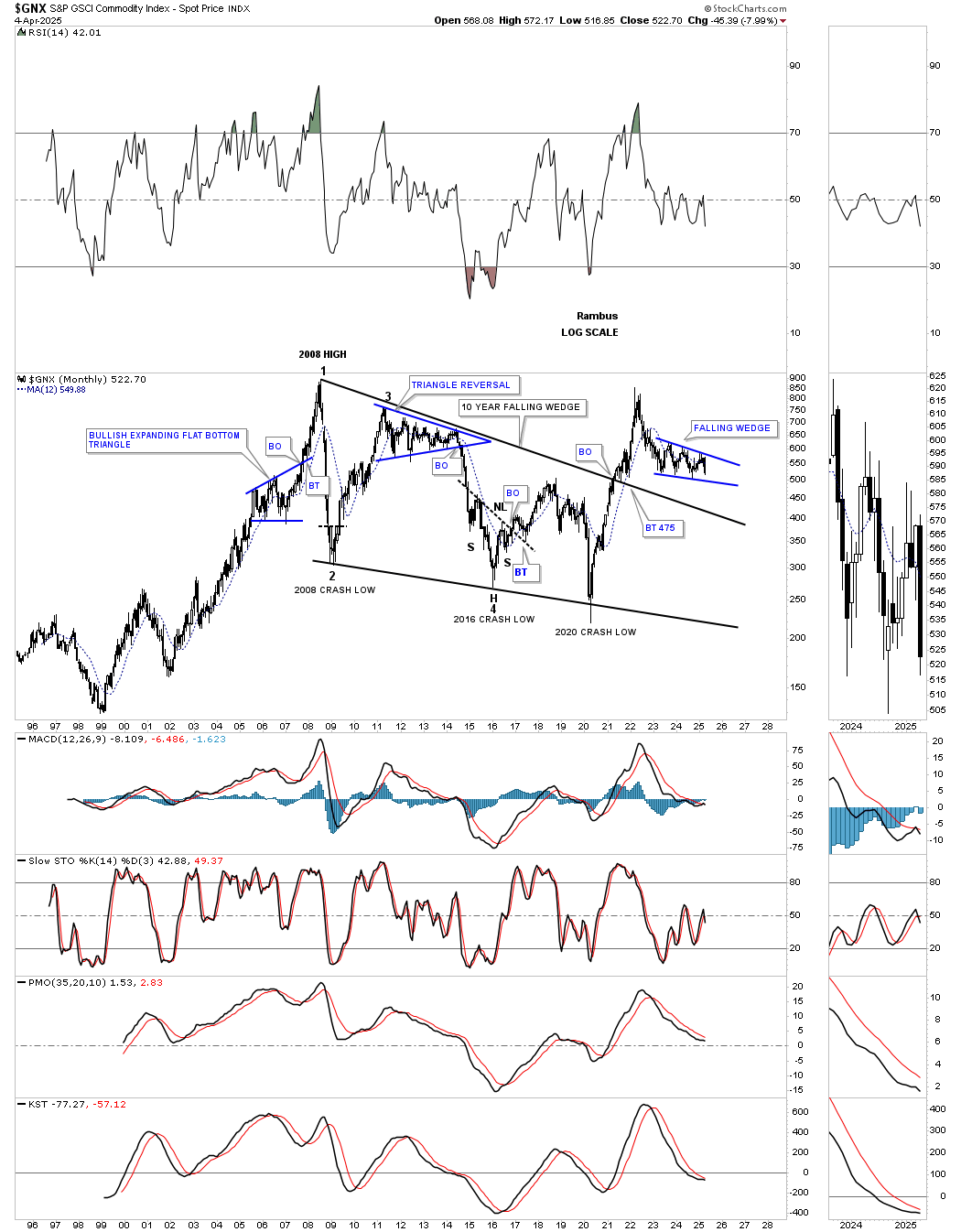
The GNX is another commodity index, which shows its 2008 bear market was a large falling wedge. The price action almost made it all the way back up to the 2008 high but ran out of gas after forming a double top. Since the initial decline, the price action has been chopping out the blue falling wedge, with the 6th reversal point completing when the bottom rail is reached. Again, I believe this is going to be a 6-point bearish falling wedge consolidation pattern that will show itself as a halfway pattern, at a minimum, with a price objective somewhere around the top rail of the 2008 falling wedge.
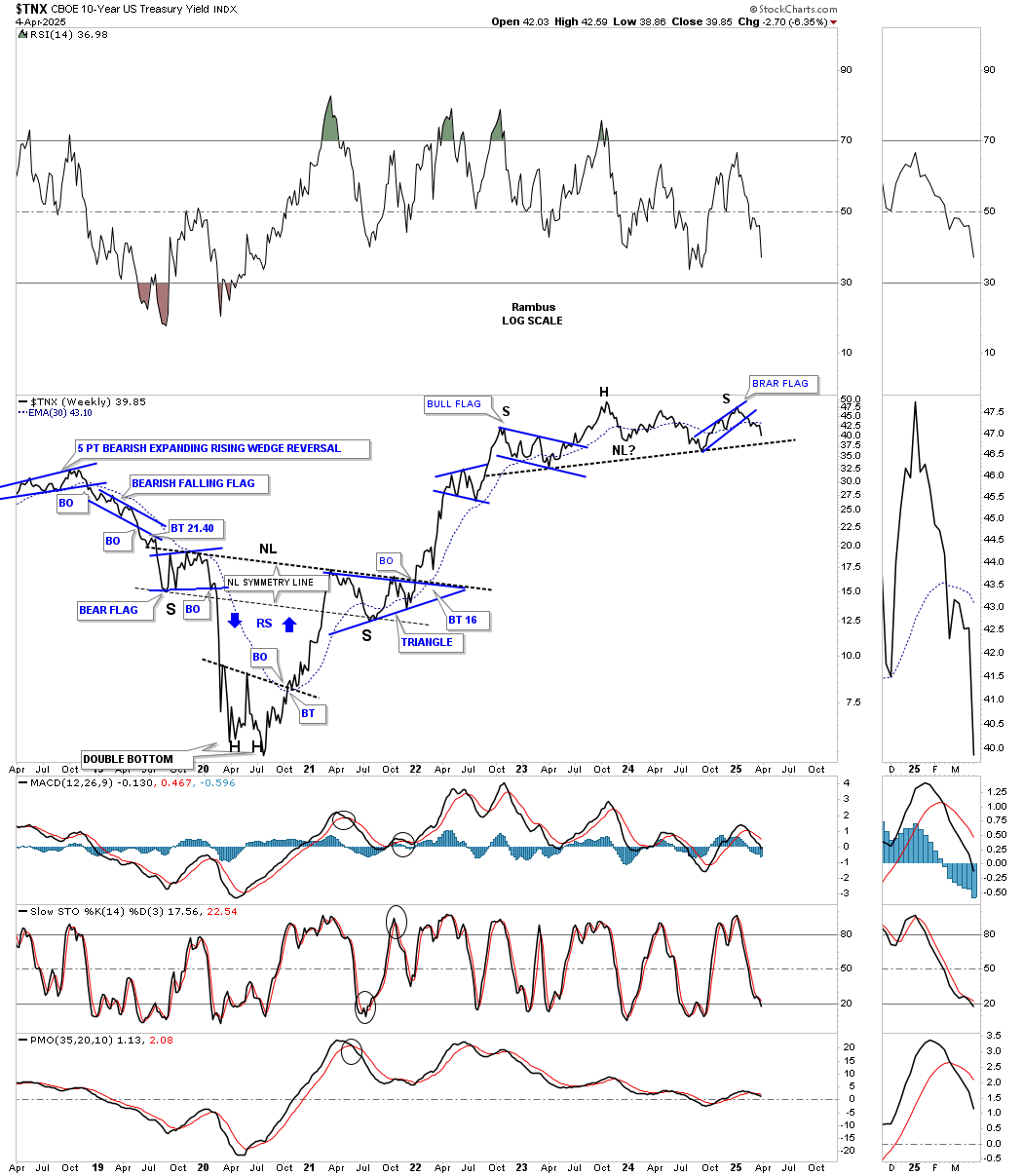
Let’s move on to the TNX and the 2-hour chart we’ve been following since the bearish rising wedge completed in early January of this year. The symmetry was suggesting that a pretty symmetrical H&S top may form, as shown by the left shoulder bullish expanding falling wedge and the right shoulder bearish rising wedge. Late last week, the price action gapped below the neckline, with the backtest now taking place.
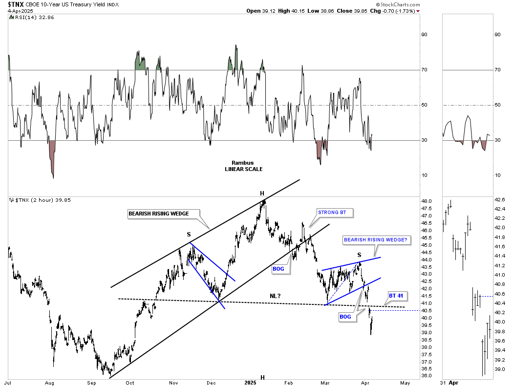
Going back to mid-2022, the TNX started forming a major H&S top that was unknowable back then. Then, in mid-2023, the rally that had taken place above what now looks like the left shoulder high ended up being the head. Then came the long, tedious decline, which finally found support in mid-2024, in which I was able to add the possible neckline. As you can see, the H&S top on the 2-hour chart above is the right shoulder high, which is strongly suggesting the neckline is going to give way to the downside.
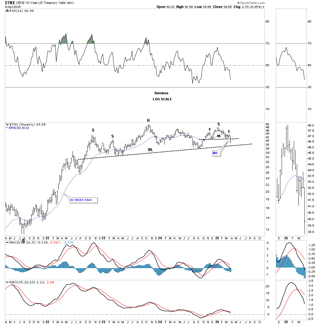
Putting that possible three-year H&S top into perspective, you can see how it formed after that very large inverse H&S bottom reversed the 1981 drop in the TNX, which was a capitulation low.
From the 2020 low, the stock markets didn’t seem to mind that interest rates were moving higher, except for the 2022 correction. After the correction ended in October 2022, the TNX was putting in the head of its H&S top and began its slow, methodical decline to the neckline before bouncing up to the right shoulder high.
What I find fascinating right now is how the stock markets have been crashing in the face of lower interest rates over the past several weeks or so, which I believe is a flight to safety, as it’s the only vehicle left for investors right now. Maybe that will change when that possible H&S top on the TNX completes and interest rates decline more vigorously, but for now, it looks like a flight to safety, at least in the short term.
If the TNX is declining, then the TLT is moving higher in an almost perfect inverse correlation, as shown on this weekly chart below. Comparing this weekly chart below to the TNX chart above, you can see the inverse H&S top on the TLT in 2020, and now, with the H&S bottom that is building out, there’s a small H&S bottom right shoulder low, which is inverse to the small H&S top right shoulder on the TNX.
Note on the left side of the chart how the price action was ramping up into the 2020 head of the H&S top when everything on the planet was crashing. Then, after the triple head completed that portion of the H&S top, everything on the planet took off in a near-parabolic rally. If the current multi-year inverse H&S bottom completes, how are the markets going to react?
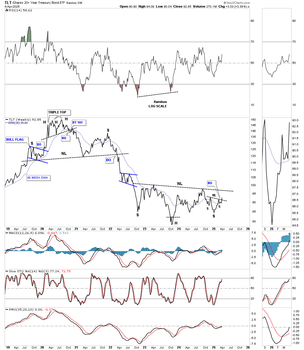
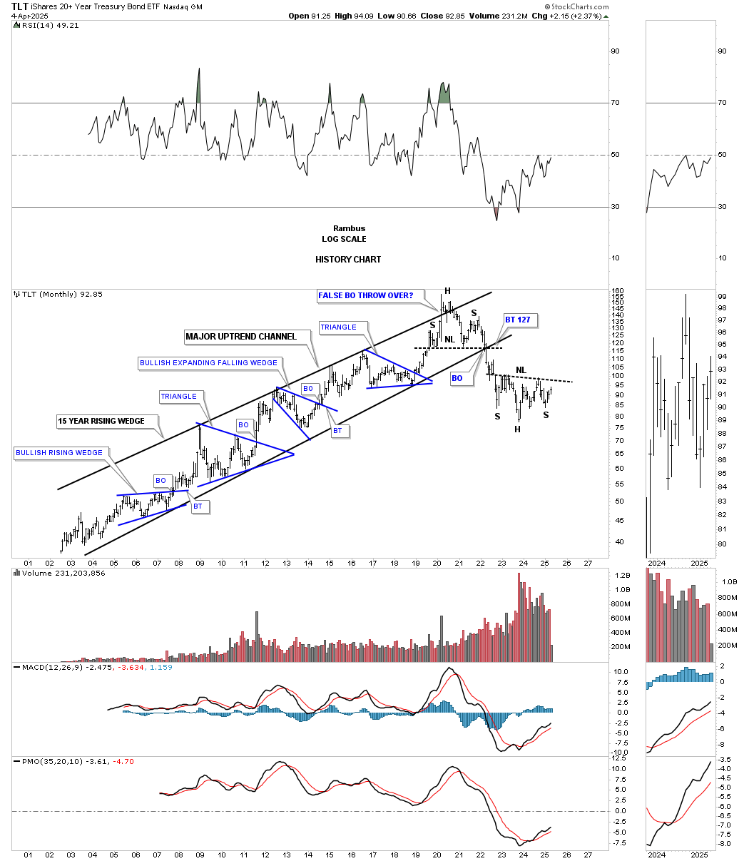
Below is the history chart for the TLT, which shows its unrelenting uptrend channel that had been in place until the H&S top finally brought it to an end. There was a 2-for-1 breakout of the neckline and the bottom rail of the uptrend channel, which signaled the move lower. Keep in mind that the minimum price objective for an H&S pattern is the distance from the head to the neckline added to the breakout point on the neckline.
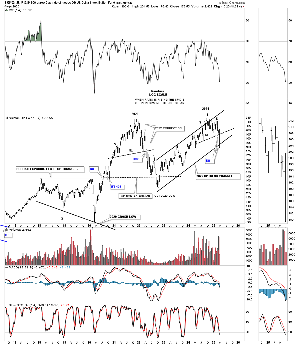
Let’s finish up by looking at some charts for the US stock markets, beginning with this weekly ratio chart, which compares the SPX:UUP. Note how the ratio bottomed, like just about every asset on the planet, at the March 2020 pandemic low. The ratio then rallied almost vertically into the 2022 high, where the correction started in the stock markets. The ratio then built the H&S top, which added another layer of confidence that the decline was going to be more than just your typical 5% to 8% pullback, which had been fairly typical up to that point out of the 2020 low.
The ratio then bottomed in October 2022, which is where the US stock markets began their next rally phase into the all-time high. It’s hard to believe, but the SPX hit its all-time high on February 19th at 6150. As you can see, another H&S top has formed on the ratio, which signaled we were going to see more than a mild correction when the neckline was broken last week. You can also see the ratio closed just slightly below the bottom rail of the 2022 uptrend channel, signaling a further decline is most likely in the cards.
There is a pattern I would like to bring to your attention that I don’t believe anyone is aware of yet, but it’s very possible with last Friday’s big gap to the downside. But first, let’s look at the daily combo chart, which shows the double-headed H&S tops that were completed late last week. Note how most of the necklines were broken with a large breakout gap, which is always a stronger breakout signal than one that fights its way through the neckline.
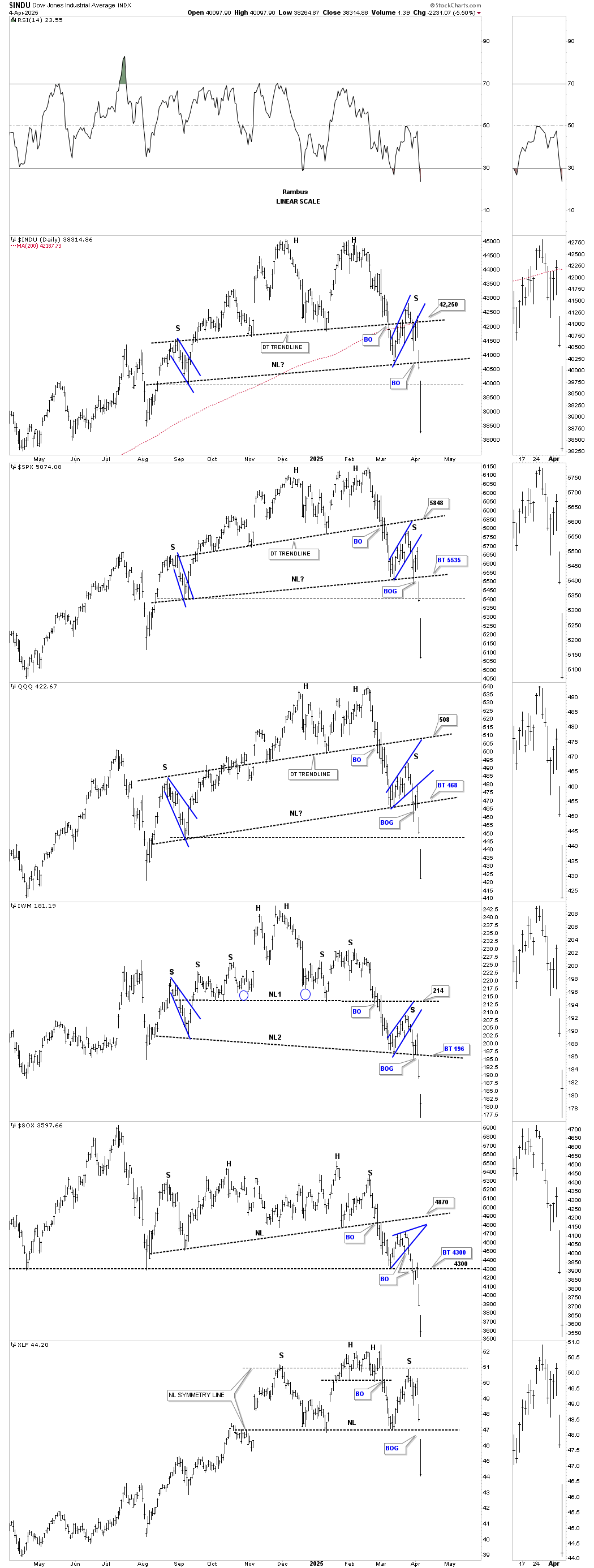
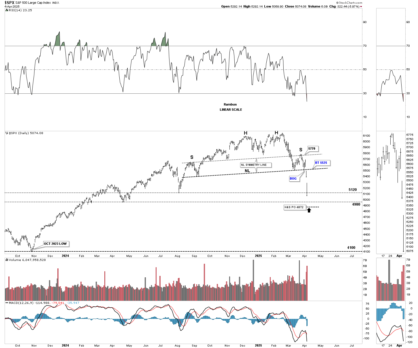
This simple daily chart for the SPX shows its symmetrical double-headed H&S top, as shown by the neckline symmetry line, which shows the high for the left and right shoulders. The minimum price objective for this particular H&S top is down to the 4872 area, which is just below two previous lows made on the way up. Keep in mind that this is just a minimum price objective, but the eight-month H&S top could be a standalone H&S top, which could mean much lower prices to come, which are unknown right now.
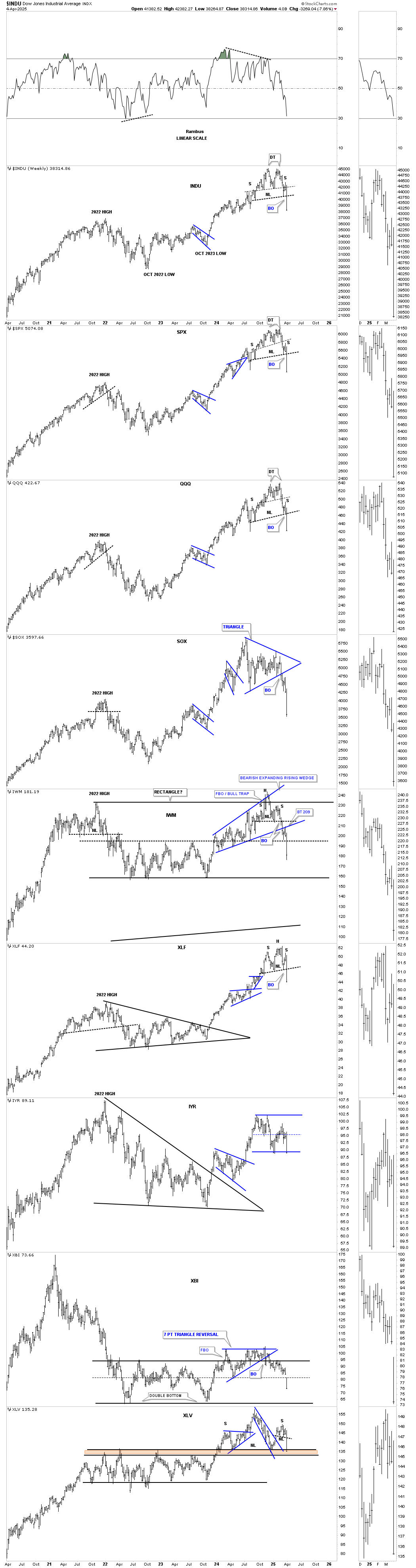
Next is the weekly combo chart for the US stock markets, which shows how the H&S tops, where applicable, fit into the big picture. Technically, the 2022 high territory should offer some important support, which doesn’t have to be at the very high, but somewhere within that topping area. It’s also possible that the current H&S top could morph into a larger double H&S top with a second right shoulder, which would need to form. If that were to occur, it would mean an even larger decline would take place, but as it stands right now, we have a H&S top reversal pattern reversing the 2022 rally.
Next is a weekly chart, which shows the Roaring Twenties bull market with the two large bullish rising patterns into the uptrend, with the blue expanding triangle being the last pattern that formed. Normally, after a long bull market comes to an end, the topping pattern usually takes quite a while to build out, but in this case, at the end of the 1920s bull market, the end came in 1929 with a very small H&S top with a down-sloping neckline, which shows a sign of weakness vs. one that slopes up.
What I would like you to focus on is the big gap made in the middle of that initial crash. That gap is called a halfway gap because it shows you the halfway point in the crash, as shown by the black arrows. After the initial crash low, the INDU built the blue bearish rising wedge, which corrected 50% of the crash and closed the gap before the real bear market began in earnest.
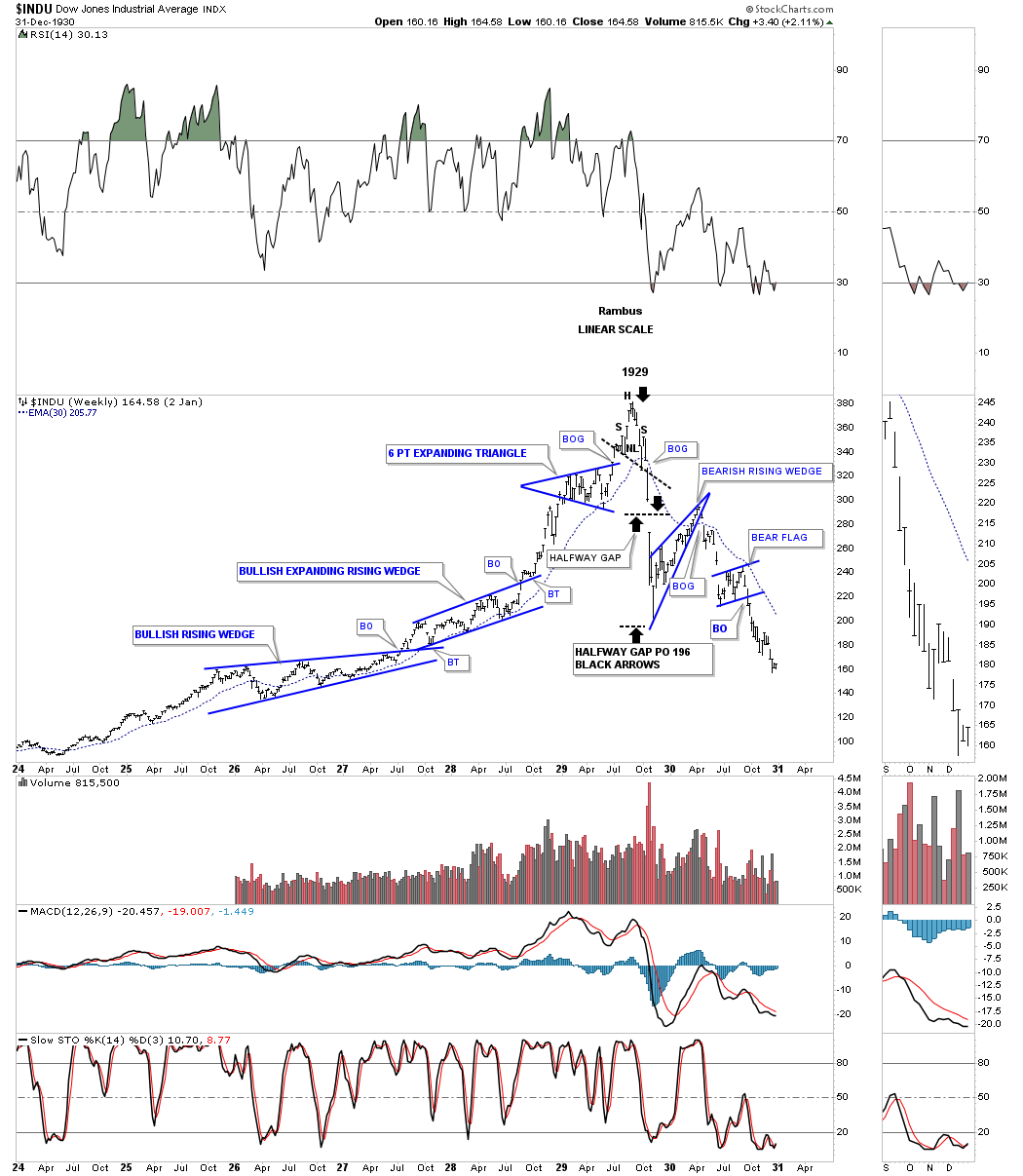
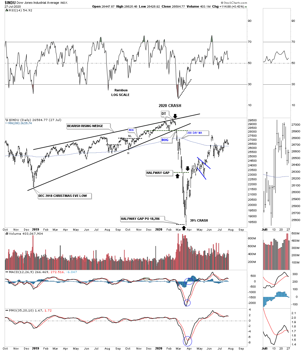
I know everyone is looking for a low tomorrow, which is very possible, but I would like to show you a possible halfway gap that is forming on the SPX and the INDU. First, let’s look at the halfway gap that formed during the 2020 pandemic crash on this daily chart for the INDU. As you can see, that halfway gap measured out almost perfectly. Also, note the bearish rising wedge and the double top that formed at the 2020 high and the backtest to the 200-day SMA right after the bearish rising wedge breakout.
INDU 2020 Halfway gap:
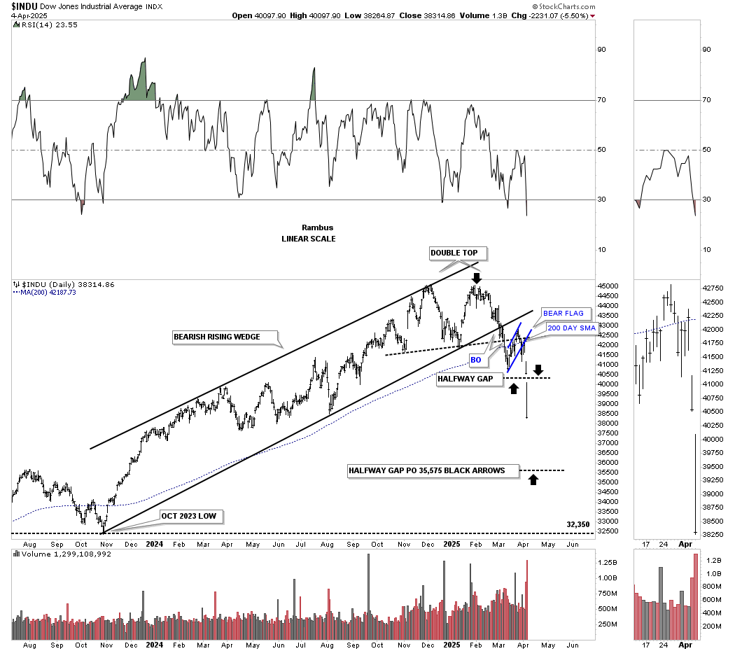
Now, for the possible halfway gap on the current daily chart for the INDU. Again, we have a rising wedge/uptrend channel with a double top, with the blue bear flag forming just below the breakout of the rising wedge and the backtest to the 200-day SMA. The black arrows show the price objective if the halfway gap plays out. It’s also possible that in a very strong impulse move down, you can see several gaps form along the way as continuation gaps.
INDU 2025 Halfway gap?
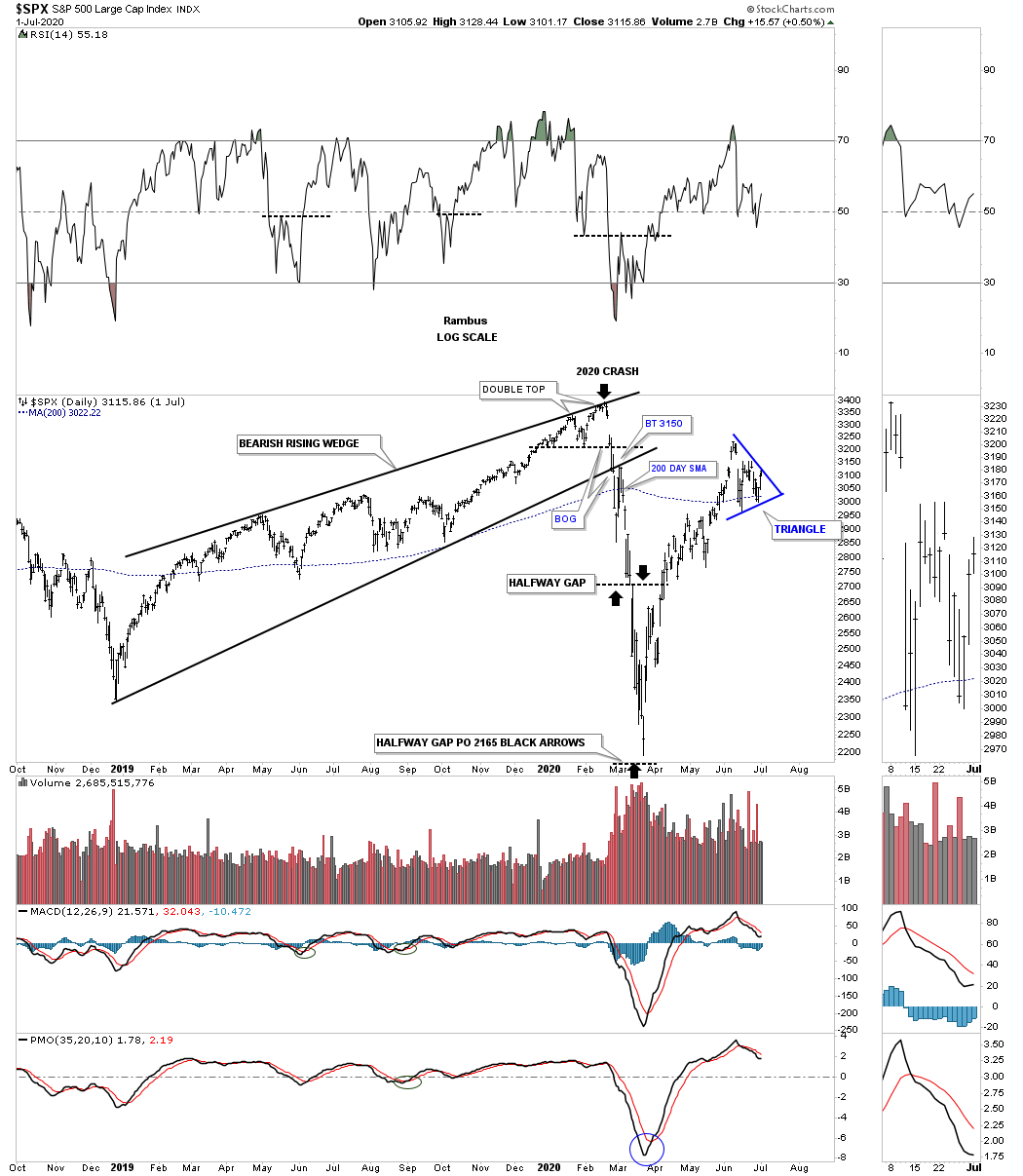
Below is the halfway gap for the SPX made back at the 2020 high. Again, you can see a bearish rising wedge leading into the high back then, and the breakout below the bottom trendline with a backtest from below and the 200-day SMA. The black arrows measured that halfway gap with a near-perfect price objective.
SPX 2020 Halfway gap:
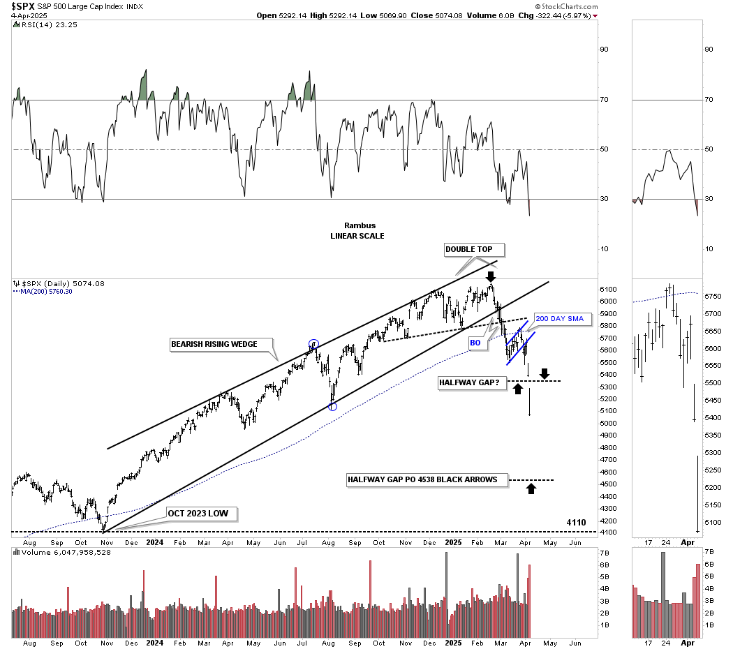
Now, the current and possible halfway gap with a very similar setup: a bearish rising wedge with a double top, followed by the breakout below the bottom rail of the rising wedge and double top trendline, and the backtest to the 200-day SMA.
SPX 2025 Halfway gap?
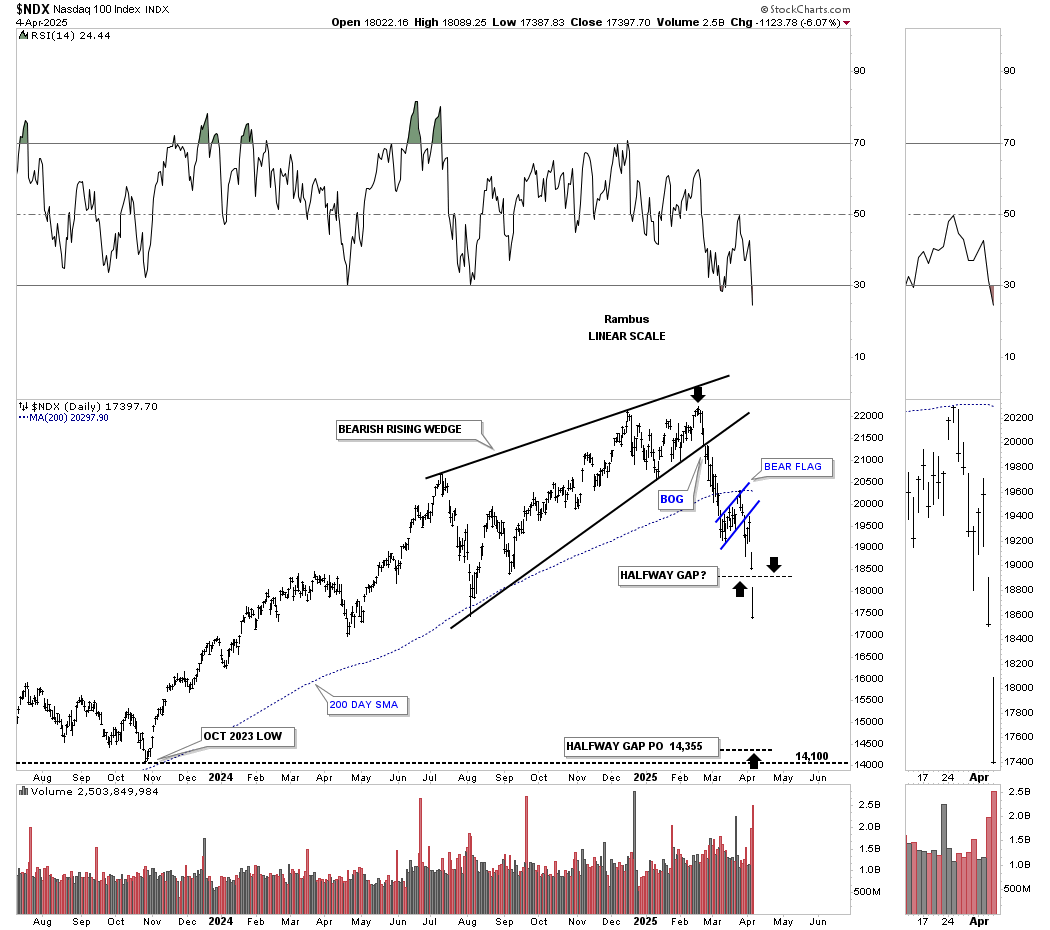
Here is a possible halfway gap on the NDX 100. Note how the price objective is down to the October 2023 low, which is where the last mild correction ended.
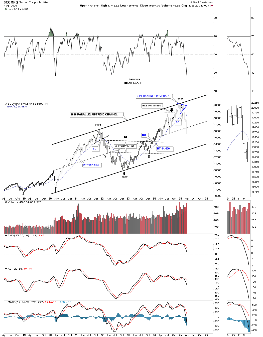
Next is the weekly chart for the COMPQ, which we’ve looked at several times, with the first time being when the price action was testing the top trendline earlier this year, and I speculated if it was going to hold resistance. Well, it did, and now the COMPQ is trading below the center dashed midline, with the bottom rail of the 2020 uptrend channel now in focus.
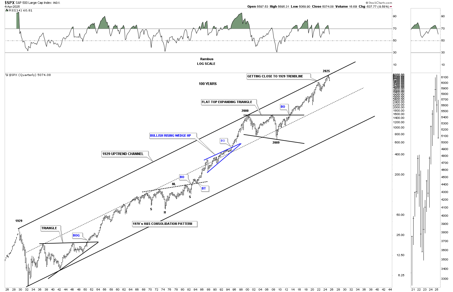
This last chart for tonight is one we’ve looked at several times recently, which shows the 100-year uptrend channel on the SPX, with the top trendline beginning at the 1929 high, a touch at the 2000 high, and almost another touch at the 2022 high, and the last touch at the 2025 high made about six weeks ago. Again, that H&S top on the SPX and on the combo chart has formed just below that 2025 high. I wonder what that 2025 high is going to look like down the road. Will it be significant or just a stopping point in the secular bull market that began at the 2009 crash low? Until that 100-year trendline is broken to the upside, it is what it is until it isn’t.
Just a quick thought on the PM complex: through the years, I’ve learned the hard way that when the stock markets are in crash mode, just about everything goes down with it, which is why I didn’t waste any time and went straight to 100% cash in the Kamikaze and PM Stock Trades Portfolios. Even though I’m still intermediate to long-term bullish and believe the PM complex is going to outperform the stock markets in the years ahead, the amount of damage that can be done in a very short period of time can be hard to repair quickly. Hopefully, the damage will be minimal.
Don’t quote me on this, but I think the PM stocks went down initially during the 1929 crash but then found their footing and massively outperformed the stock markets, which I think can happen this time as well, based on all the large chart patterns we’ve been following that are still positive.
We are living in a very unpredictable period of time right now, with all the tariffs being put in place. As I said earlier, we could wake up in the morning and find out that all the tariffs have been removed, and the markets could be up a staggering amount of points. That is not the way big institutions want to invest. Uncertainty is a bull market killer, and the bull market is dying right now, regardless of how many bulls tell you not to worry and that everything is going to be okay. Look at the charts if you want to know the truth.
I hope this in-depth look at the current market condition can help you make sense of what is taking place, so you can do what is best for you.
All the best… Rambus.
Related Reading:
- Rambus: Blockbuster Chartology – January, 2025
- Rambus: Blockbuster Chartology – October, 2024
- Rambus: Blockbuster Chartology – July, 2024
- Rambus: Blockbuster Chartology – April, 2024
- Rambus: Blockbuster Chartology – January, 2024
- Rambus: Blockbuster Chartology – October, 2023
- Rambus: Blockbuster Chartology – August, 2023
- Rambus: Blockbuster Chartology – May, 2023
- Rambus: Blockbuster Chartology – January, 2023
- Rambus: Blockbuster Chartology – October, 2022
- Rambus: Blockbuster Chartology – July, 2022
- Rambus: Blockbuster Chartology – May, 2022
- Rambus: Blockbuster Chartology – February, 2022
- Rambus: Blockbuster Chartology – October, 2021
- Rambus: Blockbuster Chartology – July, 2021
- Rambus: Blockbuster Chartology – April, 2021
- Rambus: Blockbuster Chartology – January, 2021
- Rambus: Blockbuster Chartology – October, 2020
- Rambus: Blockbuster Chartology – July, 2020
- Rambus: Blockbuster Chartology – May, 2020
- Rambus: Blockbuster Chartology – January, 2020
- Rambus: Blockbuster Chartology – October, 2019
- Rambus: Blockbuster Chartology – July, 2019
- Rambus: Blockbuster Chartology – April, 2019
- Rambus: Blockbuster Chartology – January, 2019
- Rambus: Blockbuster Chartology – October, 2018
- Rambus: Blockbuster Chartology – July, 2018
- Rambus: Blockbuster Chartology – April, 2018
- 2017 Annual Wrap Up – Does Your Pension Fund Have A Deep State Drain? – January, 2018
- 1st Quarter Wrap Up 2018 Web Presentation
- Blockbuster Chartology with Rambus – October, 2017
- Blockbuster Chartology with Rambus – July, 2017
- Blockbuster Chartology with Rambus – May, 2017
- Blockbuster Chartology with Rambus – January, 2017
- Blockbuster Chartology with Rambus – October 20, 2016
- Blockbuster Chartology with Rambus – July 21, 2016
- Blockbuster Chartology with Rambus – April 21, 2016
- Rambus: Are We in a Deflationary Spiral? – January 28, 2016
- The Dollar, Gold & the S&P 500 with Rambus – October 15, 2015